Now, we’re going to talk about the design of your emails.
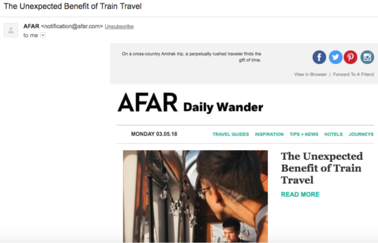
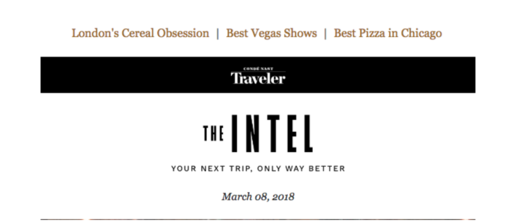
- Header Image or Design — When someone opens your email, the first thing they will see is the header image, logo, or design at the top (unless you’re just using a plain text email, of course). Ideally, this image should be immediately recognizable to your audience. That is, they should immediately know that the email is indeed from you. The header can also be used as a way to catch the opener’s attention or curiosity and draw them into the copy of the email. Here are some examples of great email headers, according to Campaign Monitor.
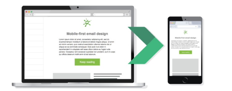
- Mobile friendly — More than 50% of people now check their email on their phone more than they do on their computer. What’s more? According to research by Adresta, an email that displays poorly on mobile devices gets deleted within just 3 seconds 70% of the time. And up to 15% of recipients will even unsubscribe. In the 21st century, your email needs to be mobile friendly.
- Clear CTA — The CTA of your email, whether a button, a hyperlink, or an image, should be clear and easy for recipients to spot. You don’t want someone to not click your CTA just because they can’t find it. Seem crazy? Well, research by ConversionXL suggests that CTAs with a unique color get more clicks than CTA colors that blend in. There’s only one way to know; try it out for yourself!
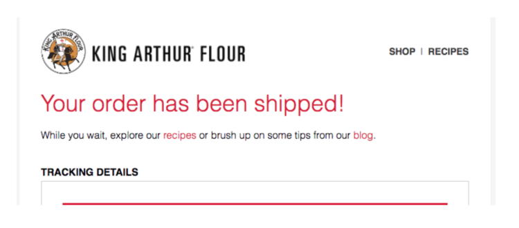
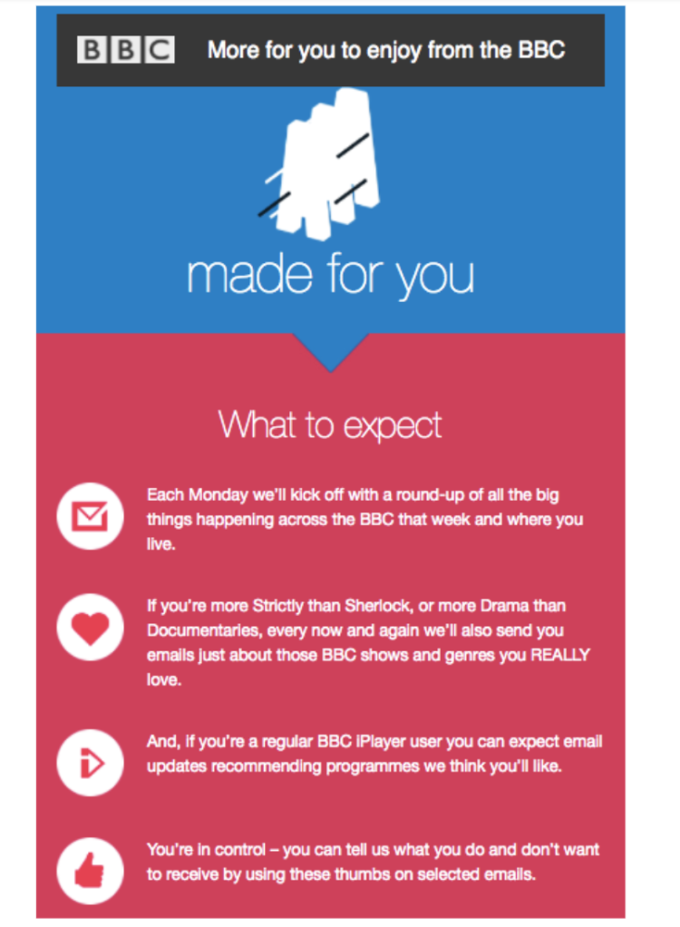
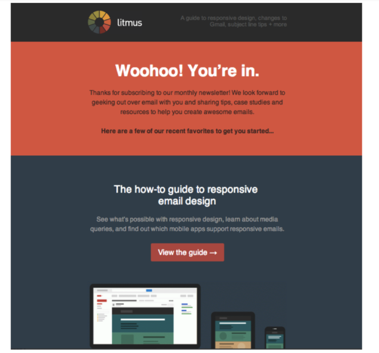
- Formatting — The overall formatting of your email should include plenty of whitespace (to go easy on the eyes), travel chronologically from top to bottom (header, title, copy, CTA), and use headings or bolded text where appropriate. The key is to make your email easy to read and even easier to skim. Most people won’t give your email a chance if it’s just one long-running block of text. Below are some examples of great email formatting.
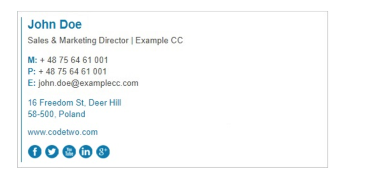
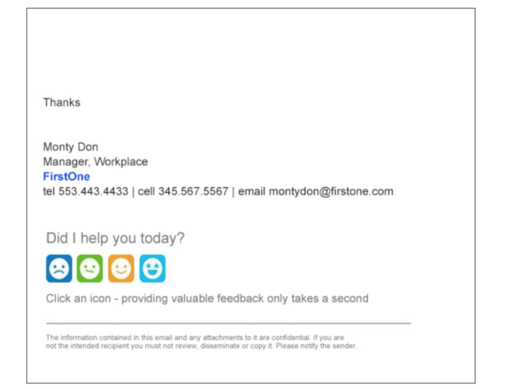
- Footer — On the bottom of every email will be the footer. This is where you can put your social media profile links, your unsubscribe button, your contact info, your logo (if you want), and anything else that you think might be helpful for your audience. Here are some examples of businesses using their email footers right.