Since branding can be a bit difficult to discuss without specific examples. Let’s walk through three big businesses that do branding well.
1. Slack
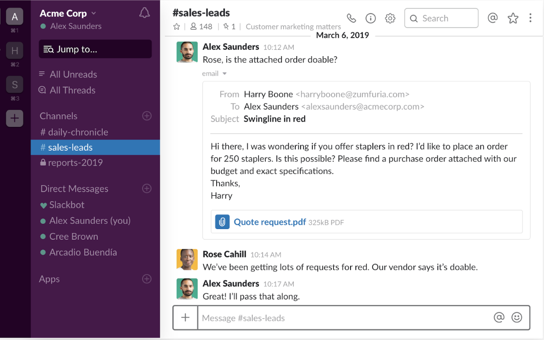
Let’s start by looking at Slack (here’s our detailed Slack email teardown), the massive business-collaboration tool with 8 million daily active users. Here’s what the Slack software looks like.
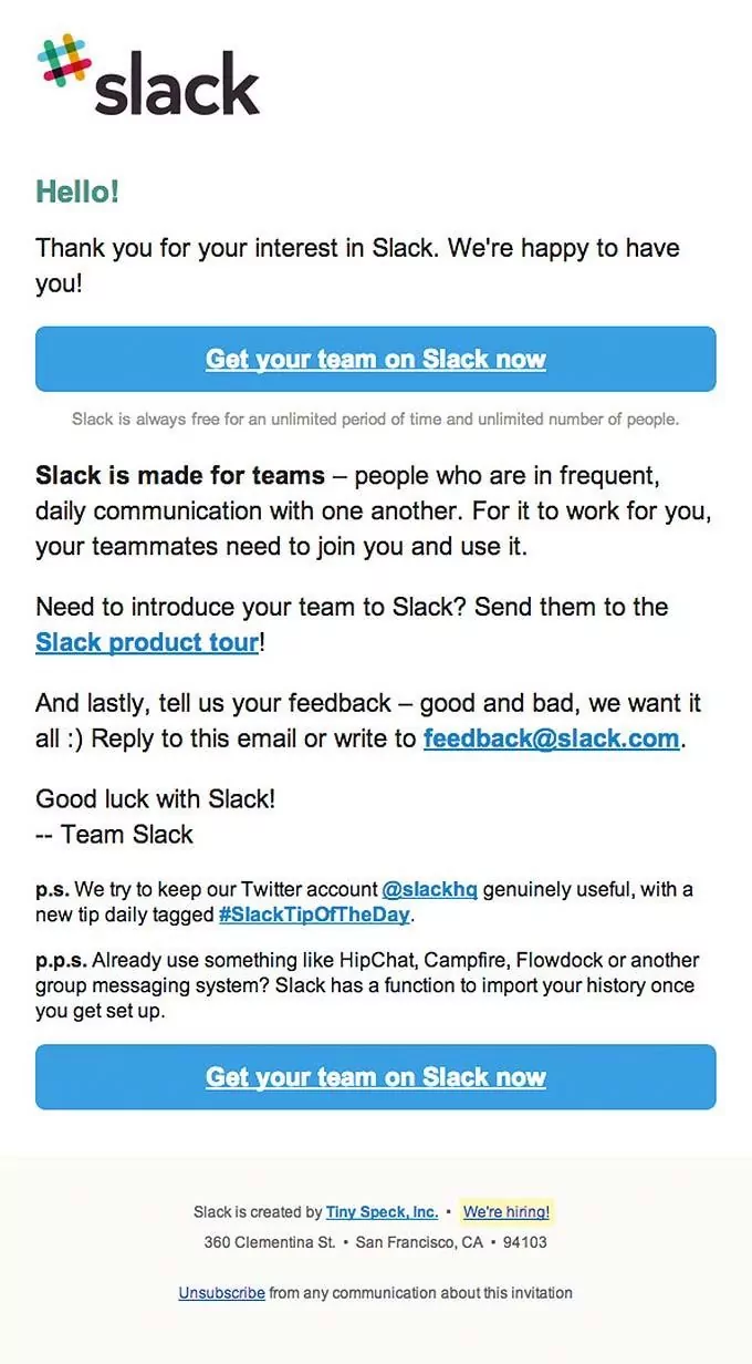
Notice the details — purple on the left, with blue and green accents, soft edges on images, and an easy-to-use interface. All of those nuances contribute to the Slack user experience. Now, compare that to one of Slack’s emails.
Notice the similar coloring between this email and their product — same green and blue and all of those colors are in the company’s logo as well. The email has a simple design, with a white background (similar to their actual product) and the language is professional but playful (with a lowercase “p.s” and “p.p.s.”).
Finally, let’s check out one of their Facebook ads.

For the sake of catching the prospect’s attention while they’re scrolling, this ad takes Slack’s branded playfulness just a step farther, but not too far. The colors are the same, the design is consistent, a “25%” stat gives the feel that they are using real customer data (not sure if they are or not) and again, the entire experience is remarkably simple, as are their emails and product.
2. Trello
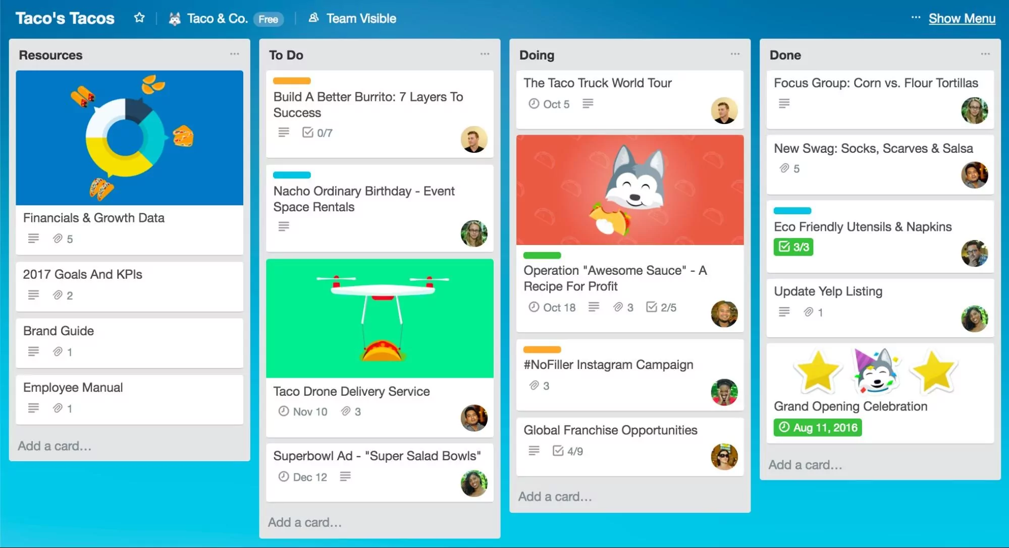
Now let’s look at Trello, an online project management software with 1.1 million users. Here’s what Trello’s tool looks like.
Users can customize the background color of their Trello board, but the default color is this typical Trello blue. Similar to Slack, soft edges and bright colors give this product a feel of casual professionalism.
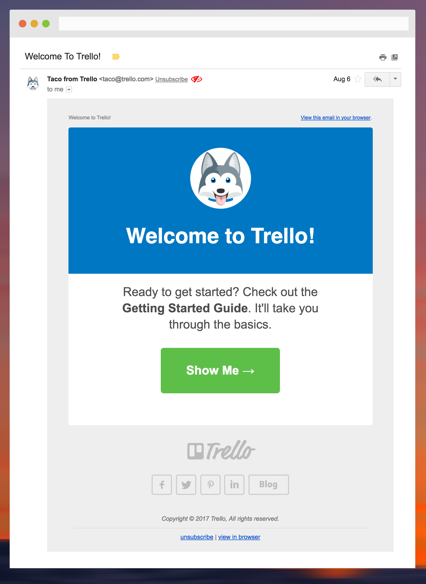
Here’s the welcome email from Trello that users receive once they sign up.
Simple, Trello-blue, and almost elegant, this email communicates exactly what the marketers behind Trello want it to communicate: that the software is easy to use and effective at organizing projects.
Finally, here’s a Facebook ad from Trello.
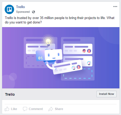
With on-brand coloring and design, Trello advertises its product by using social proof (35 million users — not sure where this number comes from) and by reinforcing that their product is simple, easy-to-use, and effective. All in all, Trello maintains consistent brand messaging across all mediums.
3. Grammarly
Lastly, we’re going to look at Grammarly, online software which helps people from all different walks of life automatically improve their writing and fix their grammar. The software currently has 6.9 million daily users.
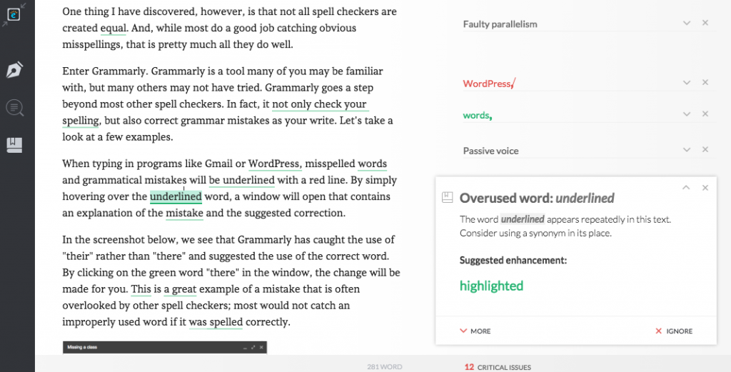
Here’s what Grammarly’s product looks like.
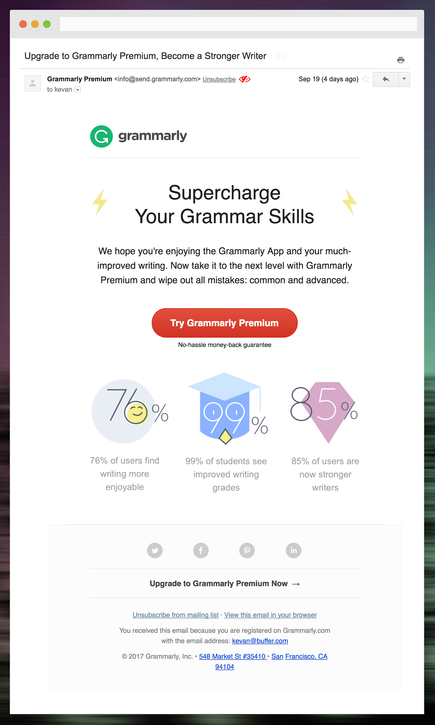
Again, this is a simple-to-use product. It has green and red accents with an off-white background, meant to make the editing process easy or maybe even fun. And the company’s emails riff on the same note. Here’s one of Grammarly’s upsell-to-premium emails.
The design of this email wonderfully matches Grammarly’s logo, depicting a playfulness that isn’t immediately obvious from reading the email copy. For social proof and to add credibility to their message, Grammarly leans on stats without overwhelming the reader. Like their product, the messaging is simple, clear, and concise.
Here’s a Grammarly Facebook ad.
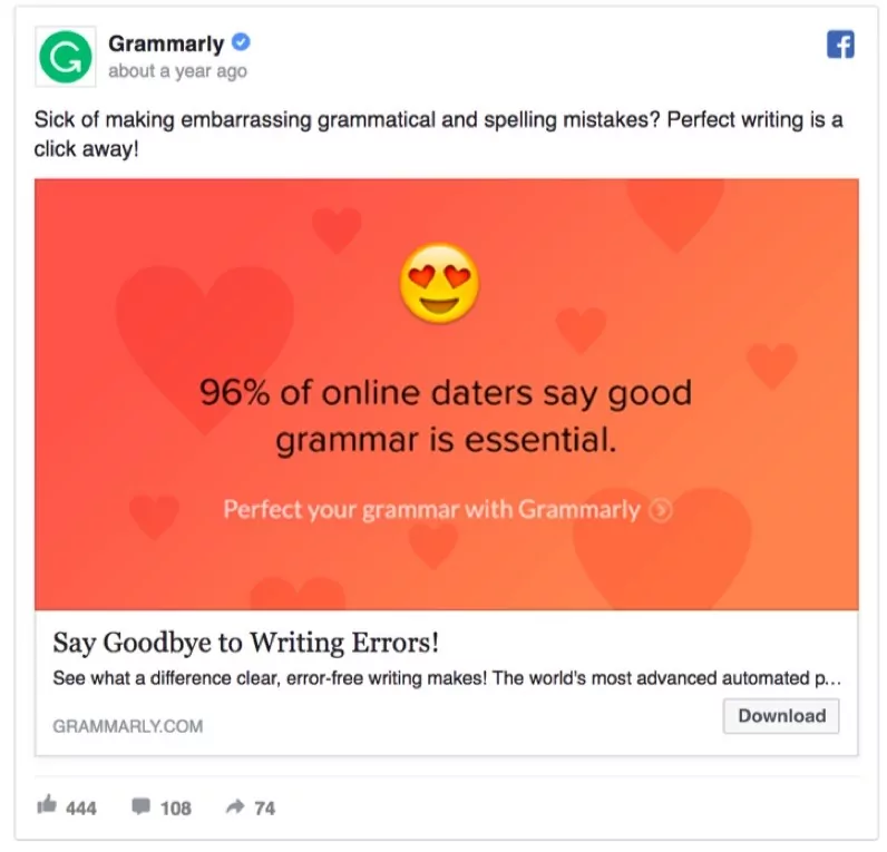
This ad, specifically aimed at single people in online dating communities (or even people who want to make a good impression on their peers) communicates in the same way what Grammarly’s product and emails do — using stats to prove their point, clear and simple language, and a fun, playful design that says “We’ll teach you to be a great writer without the strict, unbending judgment of your high-school English teacher” — an important message for a target market which is likely insecure about their writing abilities.

 (
( (
( (
( (
( (
( (
(