While designing an email and communicating exactly what your business needs to communicate with that design can feel complex and highly subjective, it doesn’t need to be. In fact, communicating the correct message with your email design comes down to following a simple set of principles, tips, and best practices. Here’s your guide.
Email Design Best Practices
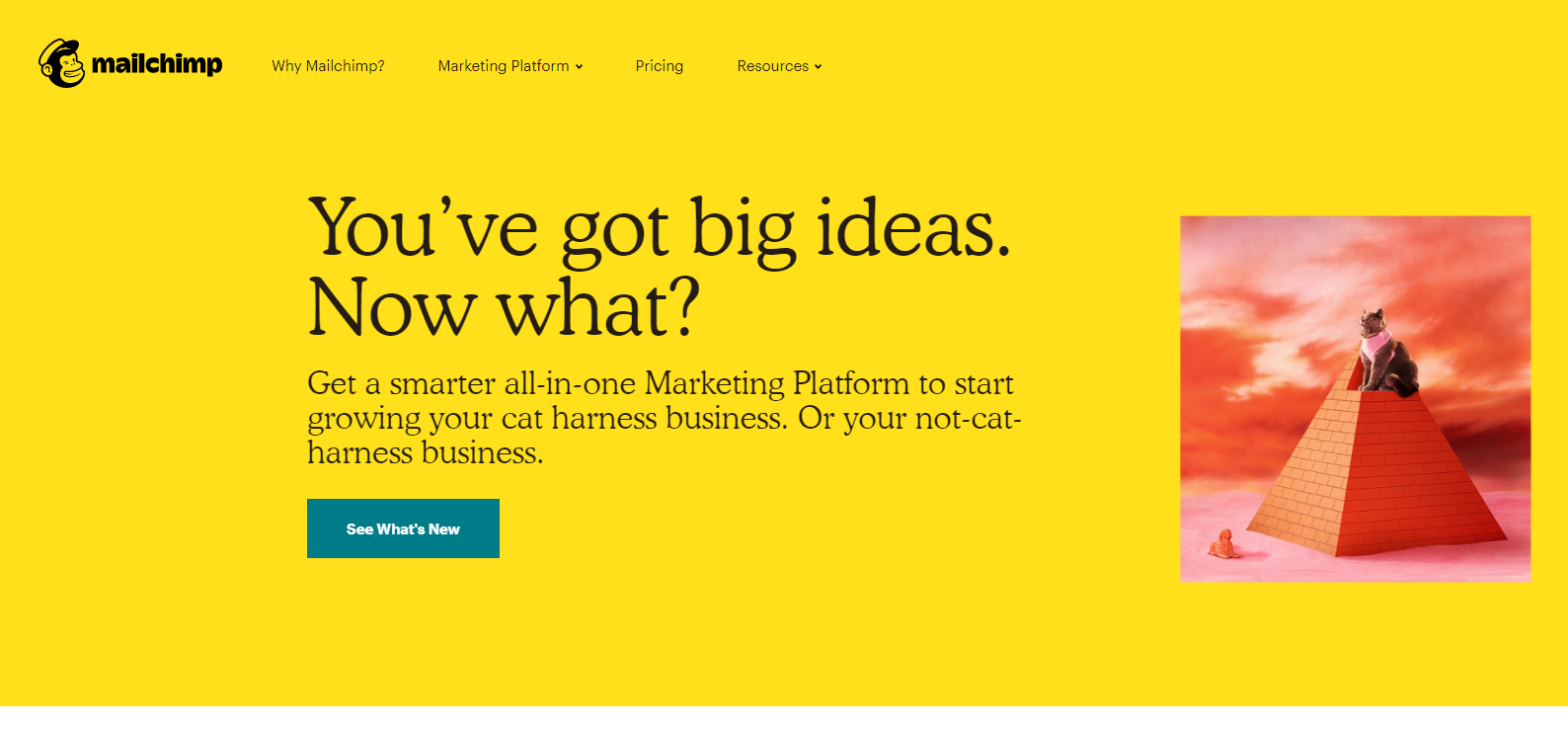
- Branding — First and foremost, your email design should replicate all other branded materials (website, advertisements, etc). When subscribers receive an email from your company, they should immediately know who it’s from; that is, the colors, images, logos, and other design elements should all trigger the emotional connection that the subscriber has with your business. Consider how similar Mailchimp’s website and email design feel.
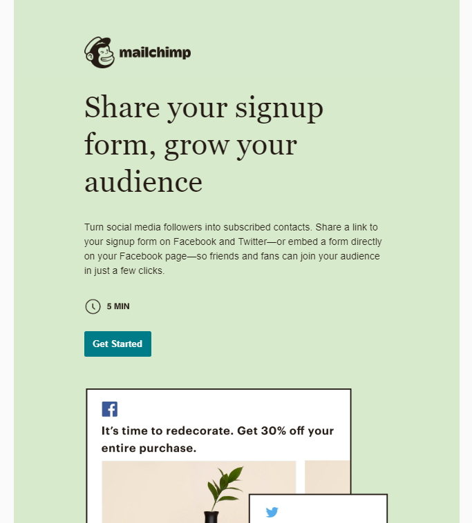
Immediately, the Mailchimp subscriber knows which company sent that email and that they can trust it.
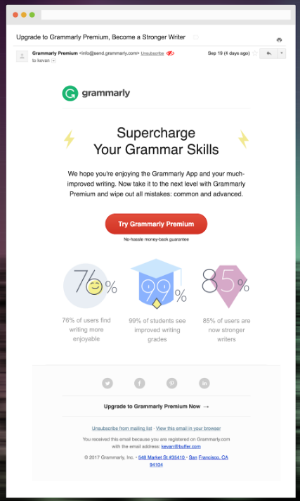
- Appropriate Proportions — If you’re not a designer, then consider hiring someone to help you make good decisions, ask a friend for their honest opinion, or stick to the campaign templates that most ESPs provide. Sometimes, when you try to go rogue, you’ll unintentionally mess up the dimensions of images, logos, and text size, which makes everything look funky (and will look 100 times worse on mobile devices). Here’s an email with appropriate proportions.
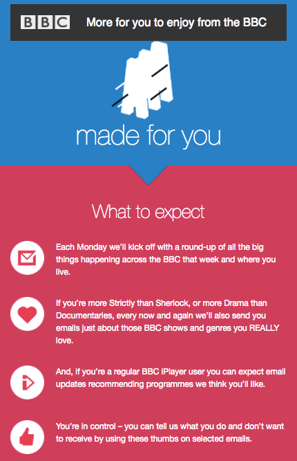
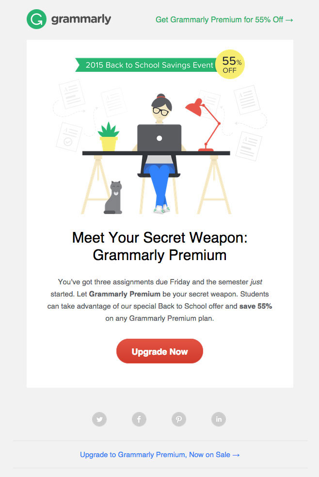
- Clear Call-To-Action — When you send an email for your business, any email, you have a goal. You don’t just want people to open your email, you want them to click and take action. Whether that’s making a purchase or managing their subscription preferences, every email has a mission. And if subscribers don’t take action, then that email has failed. Which is why your CTA must be clear, easy-to-find, and consistent with your brand image. Ideally, only have one CTA (and goal) within each email. Here’s an example of a good CTA.
- Sharp Images — Make sure that any images you use within your email are sharp and not pixelated or blurry. Even slightly blurry images will feel unprofessional and lazy to your subscribers.
- Easy Eye Path — Just like the design of a website, the design of an email tells the reader’s eyes where to go first, next, and last. Unfortunately, though, a jumbled design can confuse the subscriber in the same way that a clean design can lead them right to your CTA and have them clicking in moments. Consider, for example, how confusing this email design is.
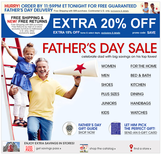
Conversely, here’s an email with easy-to-read design and a clear eye-path.
- Mobile Optimized — In today’s world, about 59% of email opens occur on mobile devices. And that’s not too surprising (just consider how often you check your email on your phone instead of your computer). This means that it’s critical your emails don’t just look good on desktop, but on all devices. Most ESPs will allow you to preview your email on mobile as well as desktop, and sometimes tablet as well. Generally speaking, single-column emails look a whole lot better on mobile devices than multiple-column emails.
Email Design Tips
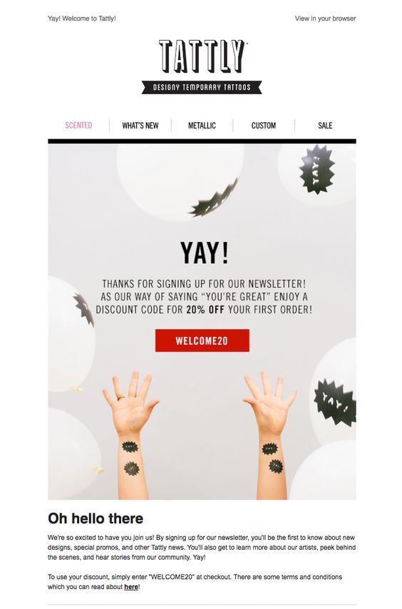
- Use a simple design layout — When it comes to designing your emails, simple is often better. It doesn’t just take less time to design a simple email, but it can also be more effective at grabbing your audience’s attention and even persuading them to click. Remember, whitespace is a good thing; it gives the eye a break and it pulls your audience to the most important elements of your email, like the CTA. Here’s an example.
- Choose a font that reflects your brand voice — Different fonts communicate different things. Even small changes in font can make a big difference in your brand image and what that text is communicating. The best way to find the right font for your business is to play around with different ones and see which matches the mood you’re trying to create. And if you absolutely don’t know which one to choose, then just go with Helvetica. That’s almost always a safe choice.
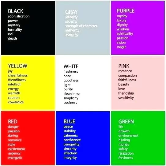
- Choose colors based on the mood you want to create — Similar to the images and the font that you choose, the colors within your email campaigns communicate something as well. They can create different kinds of moods, they can evoke certain emotions, and they can help guide the recipient’s eye from copy to CTA. Ideally, the colors you choose should be on brand and the same as, or similar to, the colors in all your other marketing materials. Consider this diagram which shows the different moods that colors create (this isn’t a hard-and-fast guide of colors and their associated moods — it’s simply intended to illustrate the different emotions that colors can evoke).
- Visually engage your audience — As all great marketers know, if you don’t engage your audience from the very first moment, you’ve lost them. That doesn’t mean you should use neon colors and obnoxious fonts in your email design, though, it simply means that your design should be visually engaging. Keep in mind that a basic and simple email design can still be visually engaging. It just depends on your audience and what they expect from you.

 (
( (
(