Assuming that Warby Parker, an evocative business idea to sell glasses online, was just going to be another failed business venture by half-hearted college students, Adam Grant, professor at Wharton, declined the chance to invest.
It sounded like a losing idea — who would buy glasses online? And none of the founders were working on the business full-time, a seemingly bad omen for investors.
Now he calls that his “Worst financial decision.”
Today, Warby Parker has a net worth of $1.75 billion, 1,400 employees, and 65 retail stores.
In the companies own words, “Warby Parker was founded with a rebellious spirit and a lofty objective: to offer designer eyewear at a revolutionary price, while leading the way for socially conscious businesses.”
Still, easier said than done. And in this teardown, we’ll answer one important question: how has Warby Parker used email marketing to become one of the most successful ecommerce brands on the planet and how are they using it today to grow their business?
Let’s start with their lead-gen strategy.
Warby Parker’s Lead Generation
According to one small survey of 151 marketing professionals in various industries, list growth is the most challenging part of email marketing.
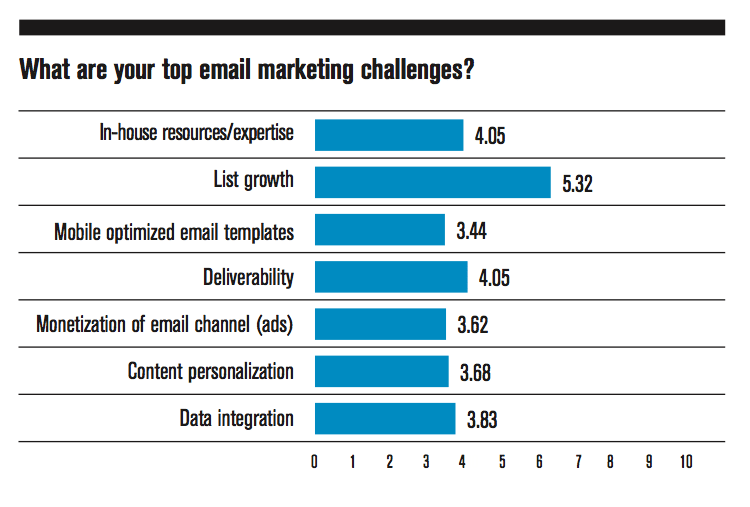
Maybe you know how to send compelling emails, engage your audience, and make sales… but growing your list is another ballgame altogether.
And looking at how other big-hitters (like Warby Parker) generate leads and collect subscribers can help your own business thrive.
So what does Warby Parker do?
How do they do it?
And which of their strategies should you steal for yourself?
When you visit Warby Parker’s website, the first thing you’ll notice is that they want you to shop… because if you shop, then you don’t just become a lead, you become a customer.
But Warby Parker’s close second goal (literally) is to get your email address.
How?
With a simple 8-question quiz.
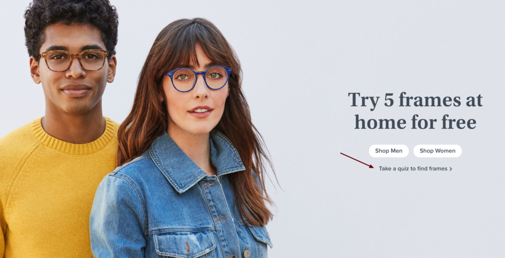
Click on that and they’ll ask you questions about what sort of frames you prefer, what style of glasses you like, and even what sort of face-shape you have. once you finish, they’ll ask for your email address…
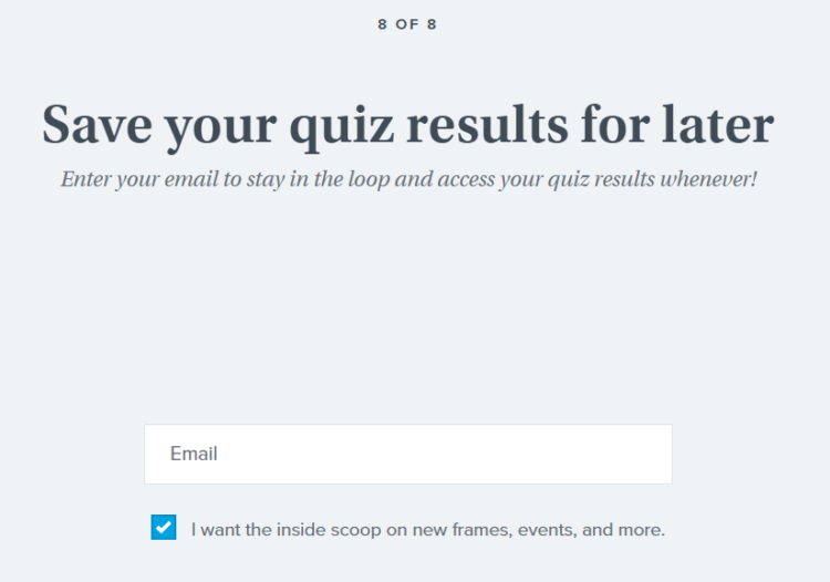
And then send you product recommendations based on your answers…
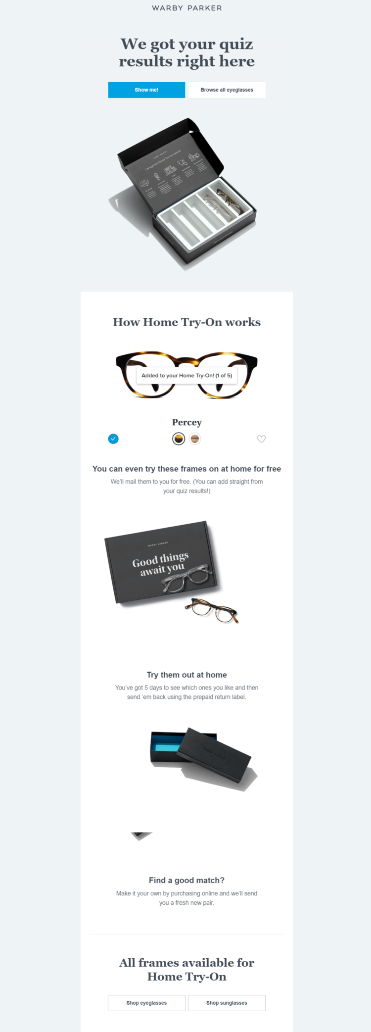
Slick, huh?
Perhaps the most genius part about this entire lead-gen process is the quiz itself.
Quiz Funnels tend to convert extremely well if you can help your audience learn something about themselves or about your product that they’ve been wanting to learn.
But what is a Quiz Funnel?
A Quiz Funnel is a simple funnel that marketers can use to generate high-quality leads.
Here’s what the steps look like…
- You create a quiz that will appeal to your target market. It’s really important that the quiz answers a question or diagnoses a problem that your target market is acutely concerned about.
- People visit your website and take the free quiz.
- To get their results, they must sign up to your email list. The Quiz Funnel qualifies them as a lead and even gives you the ability to easily and automatically segment them on your email list.
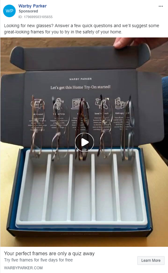
Warby Parker’s quiz is so successful that they’ve been consistently running Facebook Ads to it (it’s probably safe to assume that they’re at least breaking even on their ad-spend cost).
Quizzes are a particularly powerful way to generate leads in the personal development niche (i.e. “Take the quiz to find out which personality type you are!”).
But quizzes can be used in any niche… you might just need to get creative about what sort of knowledge you’re offering people.
Here are a few examples for different industry-types…
- B2B — “Are we a fit to work together? Answer these 5 questions for us and we’ll get in touch.”
- SaaS — “How much money are you losing without this particular automation? Take this quiz to find out.”
- Ecommerce — “Find the perfect dress for your next date + 10% off [FREE QUIZ]”
- Personal Development — “Take this quiz to get your free and unique eating plan to feel more energetic!”
Quizzes are a great way to attract attention, give your audience something enjoyable to do, and even pre-qualify your leads.
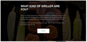
Any industry can utilize Quiz Funnels. Even Home Depot has a lead-gen quiz that helps people determine what type of “griller” they are.
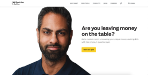
And Ramit Sethi has a Quiz Funnel that gives people a custom money-making plan based on their unique answers.
You have two basic goals when creating your quiz.
- Provide irresistible value for your audience (so that people take the quiz and opt-in).
- Ask a few questions that will allow you to meaningfully segment each quiz-taker.
You should have both of those things.
Once you’ve created a quiz that will appeal to your target market, here are a few segmentations that you can consider creating…
- Level Of Interest — How interested is the prospect in your service? Do their answers to your quiz questions indicate that they’re very interested… or just browsing? You can segment your email list based on this information and then treat each person in your sales funnel as they want to be treated.
- Demographics — How much money does the prospect make? Where do they live? How old are they? The industry you’re in and the type of products you sell will determine what kind of demographic info you should pay attention to.
- Degree Of Pain — How urgent is the person’s need? Are they experiencing a lot of discomfort or “pain” that your product can solve? Or are they barely aware of the problem they might be facing? How you communicate with your audience should be partly determined by how aware they are of the pain they’re experiencing as a result of not buying your products or services.
Understood?
Quiz Funnels are great. And we highly recommend them. 😉
Warby Parker also has this simple opt-in bar at the bottom of their homepage…

Here’s the thing: some people who visit your website will love what you’re doing. Maybe they love your products. Maybe they love your content. Or maybe they just love your brand.
Whatever the case, something about your brand connects with them… probably because they’re your target market.
But… they might not be ready to buy from you yet (for various reasons).
You need to give those people an easy way to sign up for your newsletter so they can stay in touch with your business. A simple opt-in bar like the one above will usually do the trick.
And last but not least, Warby Parker has an easy account-creation form that collects people’s names and email addresses.
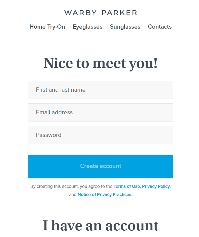
The most common place this is used is when someone wants to buy a product, they have to create an account.
And while some consumers claim that account creation makes them abandon their cart, this is a bit of a necessary evil… because if you don’t collect your customers’ email address and account information, then it’s going to be really hard to build any sort of sustainable business.
The trick is to make account creation as painless as possible.
Don’t suddenly bombard your customers with questions — just require name, email address, password, and maybe one more thing. But that’s it.
Then let the person buy from you in peace.
Now… onto Warby Parker’s welcome email…
Warby Parker’s Welcome Email
In an effort to understand Warby Parker’s email marketing strategy, we subscribed and kept track of every email they sent us. Here’s the welcome email we received.

This email does a lot of things well.
First, it has Warby Parker’s logo right at the top of the email so that subscribers instantly recognize the brand — it then subtly encourages you to shop right away by putting a navigation bar at the top with “Eyeglasses,” “Sunglasses,” and “Locations” (in case you want to find a brick-and-mortar store near you).
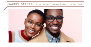
Welcome emails have an average conversion rate of 3% (which is comparable to other email marketing campaigns), so it’s definitely worth adding a little shop-now nudge — like Warby Parker does here — to capture sales from people who want to purchase right away.
The next piece of this email is simple but very important…
Warby Parker says, “Thanks for signing up!”
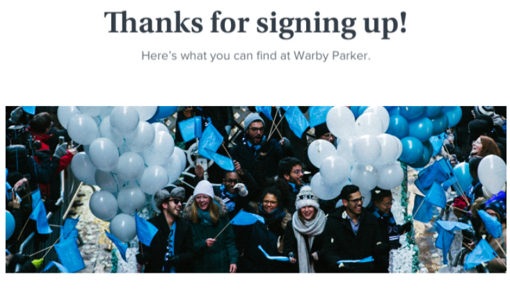
There are a lot of different ways to thank subscribers for signing up to your mailing list. Some companies offer a coupon, some try to make the subscriber laugh, and some just say “Thank You.”
How you thank your subscribers will be unique based on the target market that you’re trying to attract and the brand image you’re trying to build.
But however you do it, you need to say “Thank you.”
The remainder of Warby Parker’s welcome email serves as an introduction to their brand. There’s a link to read their startup story…
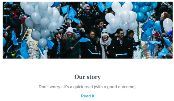
…a link to learn more about their at-home try-on kit…
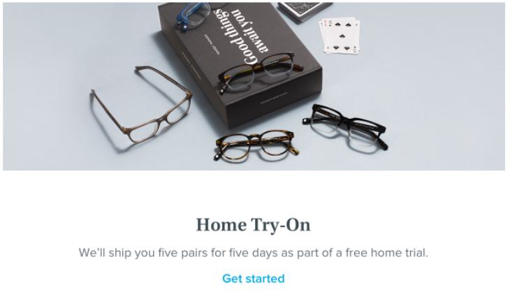
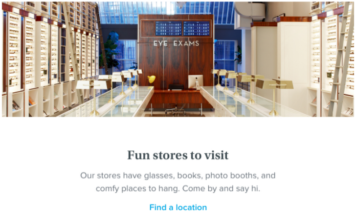
…a link to find a nearby location…
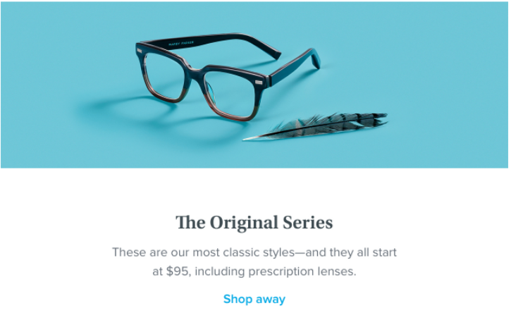
…a link to start shopping right away…
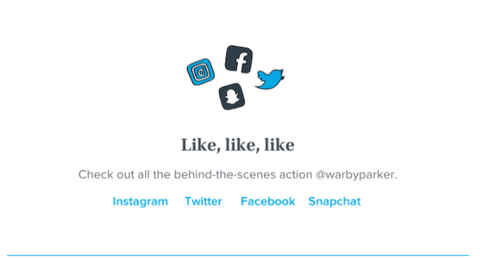
…and a link to connect on social media…
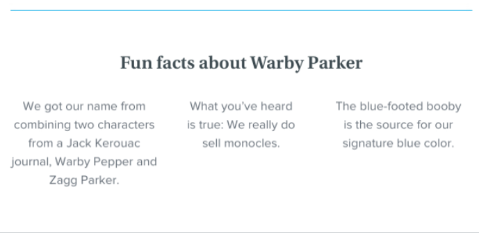
…and a short list of fun facts about Warby Parker.
In other articles, we talk a lot about only having one CTA per email. But welcome emails are a bit of an exception — your welcome email is a great opportunity to tell your business’ story, ask subscribers to connect on social media, and encourage them to shop.
Doing all of that (telling your story, sharing your company values, or including fun facts about your business, etc) upfront within your welcome email can actually be an important part of building a long-term relationship with your subscribers, which can result in more sales down the road.
(76% of consumers would buy from a brand they feel connected to before buying from a competitor)
But that isn’t all Warby Parker does for their welcome email — 3 days later, we received the second part of their welcome sequence.
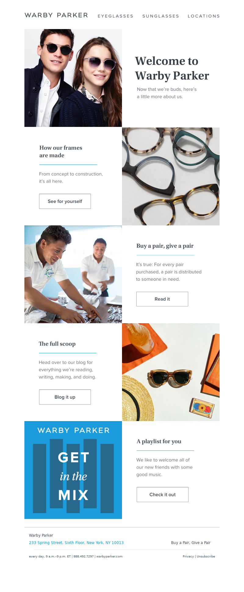
Overall, this email is interesting because… well, beyond the top navigation bar, it isn’t trying to sell anything. It seems to be authentically trying to just introduce new subscribers to the Warby Parker brand.
There’s an important online business lesson here: namely (like we’ve mentioned in other articles), people don’t buy what you do, they buy why you do it. In other words, the more that your subscribers identify with your brand and its values, the more likely those subscribers will be to purchase from you over and over again.
But of course, your audience can’t identify with your brand if you don’t tell them what your brand believes, what its values are, how it operates, and what its mission is.
That’s the genius behind this second welcome email. It makes Warby Parker feel transparent, giving the business a sort of personality that the consumer can identify with. It reveals how Warby Parker makes their glasses frames.
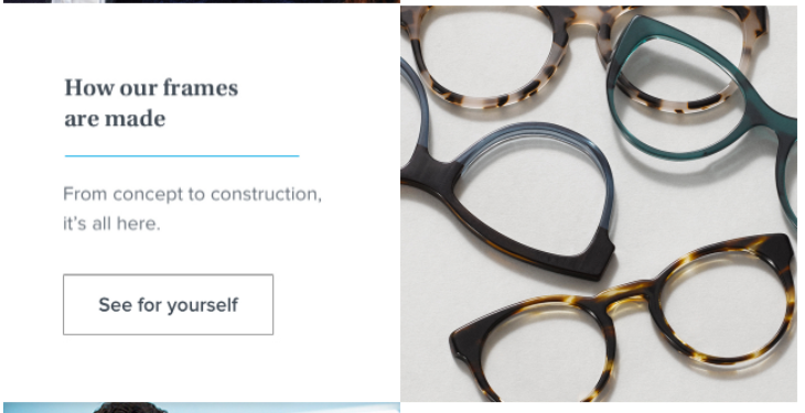
It illustrates a core value with their “Buy a pair, give a pair” policy.
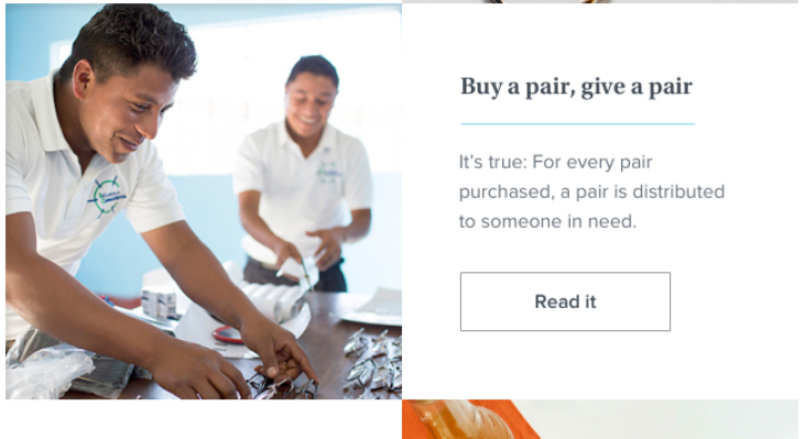
It introduces you to their blog.
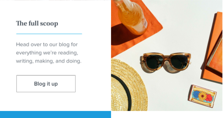
And it even allows you to check out some of the company’s favorite music.

Sure — most of those things have nothing to do with selling more glasses. Warby Parker marketers know that. But they have everything to do with building a longterm, sustainable, much-loved, billion-dollar business.
If there’s one thing that Warby Parker’s welcome emails do phenomenally well, it’s building an easy-to-love brand image that immediately connects with its subscribers.
Warby Parker’s Weekly Emails
After the initial welcome emails that we received as a new subscriber, Warby Parker emails once or twice per week, typically on Tuesday, Thursday, Friday, or Saturday.
According to research by CoSchedule, Tuesday and Thursday make the most sense — those are the two best days to send email marketing campaigns.
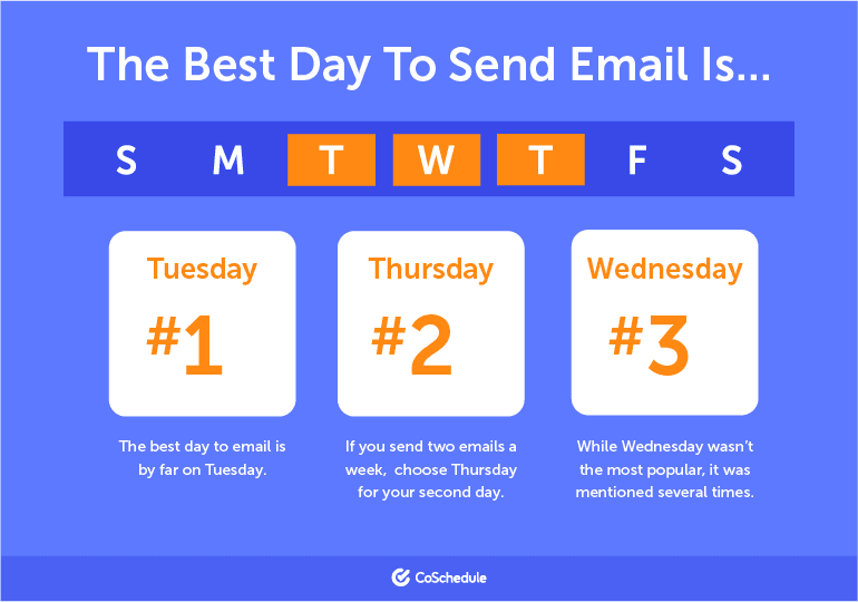
Most of Warby Parker’s weekly emails announce a new product, a sale, or build brand awareness. Here’s the first Warby Parker weekly email we received that was marketing sunglasses for summer.

This is probably a good time to mention the importance of timing when promoting certain products. You wouldn’t want to spend time and money marketing sunglasses during the winter and you wouldn’t want to advertise snowboards during the summer.
Those are obvious examples, but you get the point: consider the season and time-of-year when you launch or promote one of your products.
Also notice that, in this Warby Parker promotional email, they sell the dream of their product — images of good-looking people hanging at the pool, wearing the Warby Parker sunglasses helps customers envision what it’ll be like to use their product.
Keep in mind that people are mostly emotional creatures (which is why The New Yorker wrote this article titled, Why Facts Don’t Change Our Minds) and we need to envision a product before we buy a product. Then, we need to logically justify the emotional decision to buy — within this email, feature descriptions help with that.
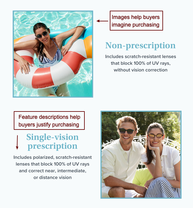
That’s a great way to structure a sales email — sell the emotional decision with images and sell the logical justification with feature descriptions, social proof, and other compelling elements.
Warby Parker is also an expert at sending new product announcement emails. Here’s an example…
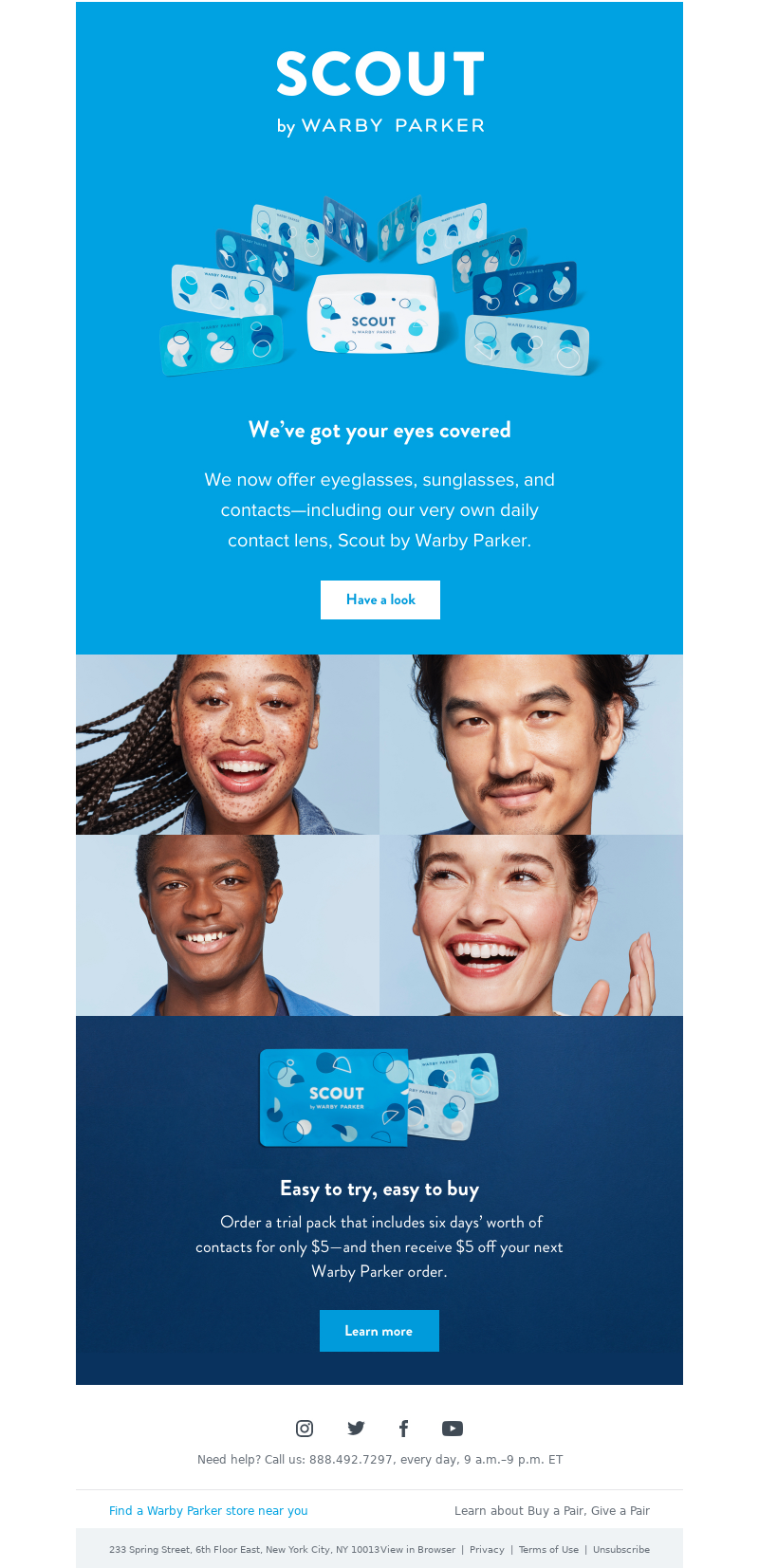
And another example…
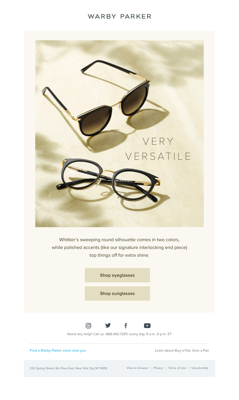
These emails give customers and subscribers the sense that Warby Parker is constantly at the forefront of innovation in their industry. Which is important; because generally speaking, customers stay loyal to companies that keep innovating, that keep working to build better products, and that keep trying to help people in new ways.
In fact, one study reveals that a whopping 84% of consumers prefer to buy from companies that are at least somewhat innovative.
(Not surprising if you consider that the most innovative companies are also the most successful — Amazon, Google, Apple, etc)
But how does that apply to your email marketing efforts?
Well, there’s a difference between being innovative and showing your innovation.
Innovation — as it relates to your customers — is all about finding new and amazing ways to help your customers, it not necessarily about creating new products all the time. Even sending out surveys to better understand your customers, offering exclusive discounts, or iterating an existing product can feel like innovation to your audience.
So are you innovating enough? Do your emails communicate an innovative spirit?
That’s certainly something to consider.
Ultimately, Warby Parker’s weekly emails do a great job of creating a sense of innovation with their audience, helping their target market envision what it will be like to own their sunglasses (with photos), and then helping buyers justify the emotional decision to purchase (mostly with the sales copy).
Warby Parker’s Abandoned Cart Email
The abandoned cart email is one of the most important pieces of any email marketing strategy. According to one source, all online ecommerce stores lumped together have an average 68% cart-abandonment rate.
That’s huge.
And in order to avoid losing sales, Warby Parker sends this email 4 days after the cart abandonment.
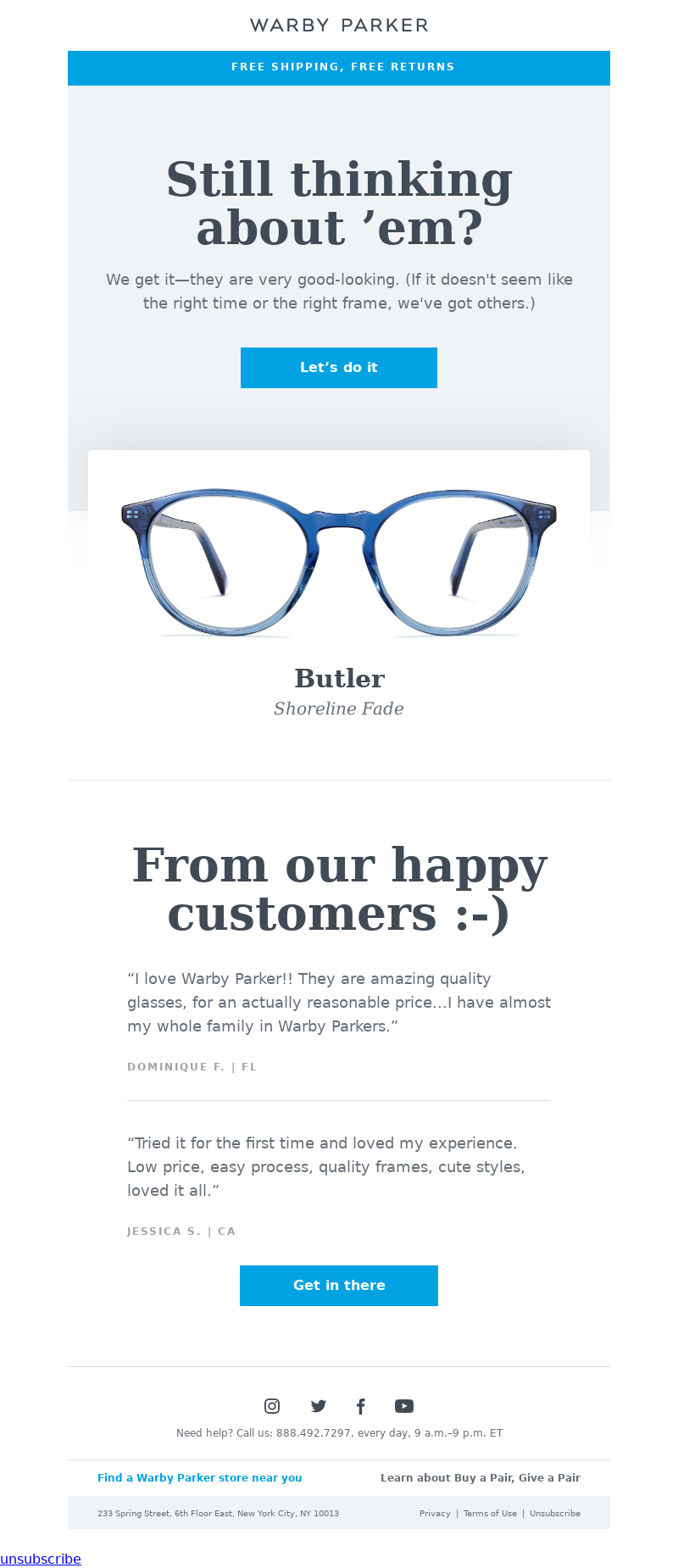
The fact that Warby Parker sends this email 4 days after cart abandonment, and only this email, is pretty significant. Most online marketing advice recommends that you send one follow-up email as soon as possible, another one the next day, and another email 2-3 days after that.
All in all, it’s not unusual to have 4 or 5 emails in a cart abandonment follow-up sequence.
But Warby Parker only has one email follow-up… and it sends 4 days after abandonment.
Why?
Well, it’s safe to assume that Warby Parker, a billion-dollar business, didn’t just play bingo to determine the best time to send their abandoned cart email… they tested it.
And there are a few reasons that their split tests may have erred in favor of a single delayed cart abandonment email.
There’s certainly something to be said for…
- Only following up ONCE so as to avoid annoying your subscribers.
- Waiting 4 days in between abandonment and follow-up so as to allow for consideration time (after all, if someone just abandoned 5 minutes ago, an abandoned cart email might not work because they haven’t had enough time to think about it).
Oh — and we don’t have direct evidence that this quote has anything to do with Warby Parker’s abandoned cart email… but it certainly seems to be advice they’re following…
“Watch what everyone else does — do the opposite. The majority is always wrong.” — Earl Nightingale
As for Warby Parker’s abandoned cart email content, they do a few really important things.
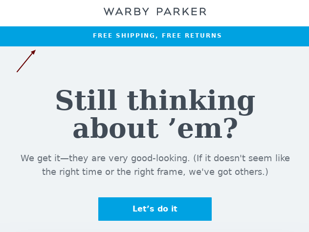
First, they include a “Free Shipping, Free Returns” banner at the top — a good reminder that there’s almost no risk in purchasing.
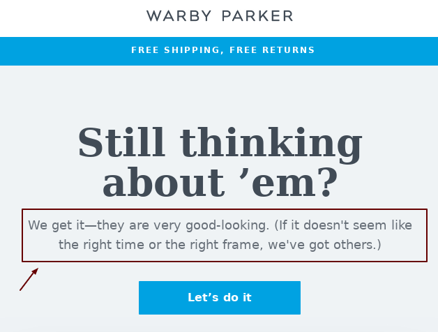
Then, they subtly mention that if you, the prospect, are no longer interested in these glasses, they’ve “got others.”
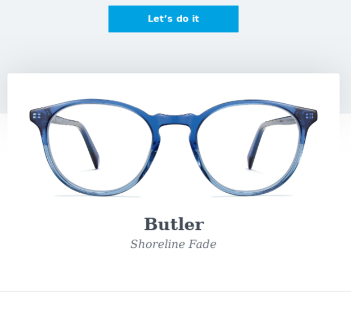
Next is a picture of the product the abandoned cart email is referring to (always good to remind your prospect)…
And finally, here’s the dead-simple but most genius part of this email: testimonials.
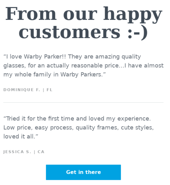
There are a lot of different reasons that people abandon their shopping cart, but perhaps the most common reason of all — expressed in many different ways — is because they don’t yet trust your brand.
And one of the best ways to build trust with your subscribers is to show them that other people just like them LOVE your products, that they’ve had a wonderful experience working with your business.
This is a no-brainer tip that can seriously increase the conversion rate of your abandoned cart email(s) — include a few glowing testimonials, always.
Warby Parker’s Post-Purchase Email
If you think that the emails we’ve discussed from Warby Parker so far are amazing, wait until you see the company’s post-purchase email sequence.
This is where Warby Parker really shines and it’s probably why the company has become as successful as it is — they always put the consumer first and try to make purchasing and testing as seamless as possible.
That’s right: testing. By that, we mean they allow people to order “Home Try-On” kits. You just select from their website which styles you want to try on and they’ll ship them to you free of charge.
Here’s the email we received after ordering our Home Try-On kit.
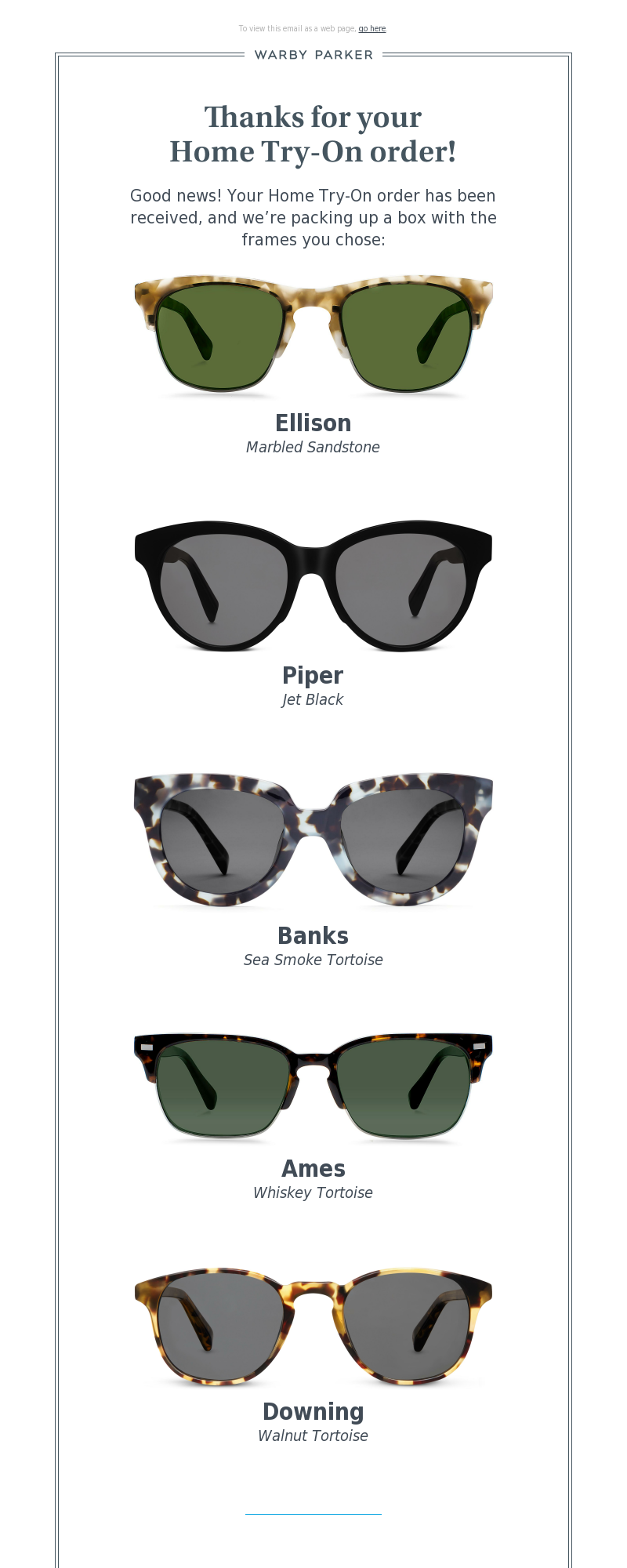
This is just a simple, friendly notification that, yes, Warby Parker received our order. It’s also a handy reminder for which frames we asked to try on.
Then, 3 days later, we received multiple emails from Warby Parker (we hadn’t purchased yet). Here’s the first…
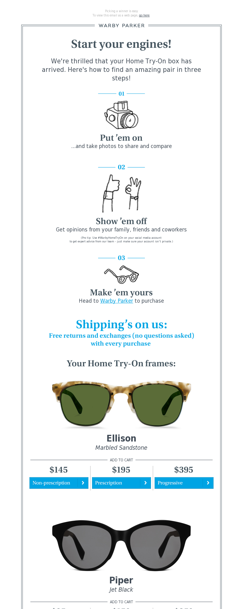
We love this email. There are a few other similar emails that come in on day 3 after ordering your try-on kit, but this one is the best. Because rather than leave you hanging, wondering what the next steps are after you receive your kit, they tell you exactly what to do.
Put ’em on, show ’em off, make ’em yours…
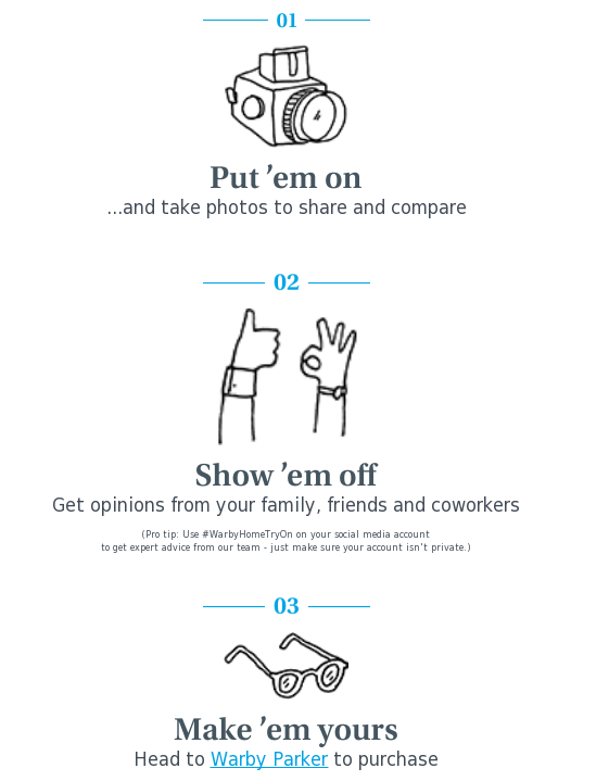
Here’s the simple genius behind this: Warby Parker is telling their potential buyers exactly what they want them to do — try, share, buy. Too many companies make the mistake of not walking customers through every step of the process and they pay because of it. Since Warby Parker makes this process dead-simple, they likely get more conversions and more sales than competitors.
Additionally, Warby Parker makes sure to consistently advertise their free shipping and free return policy (even in this email)…
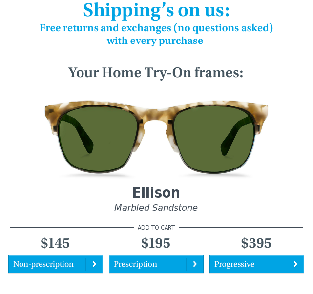
Here’s the next email we received…
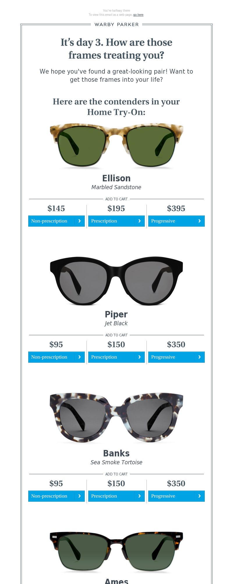
And the next…
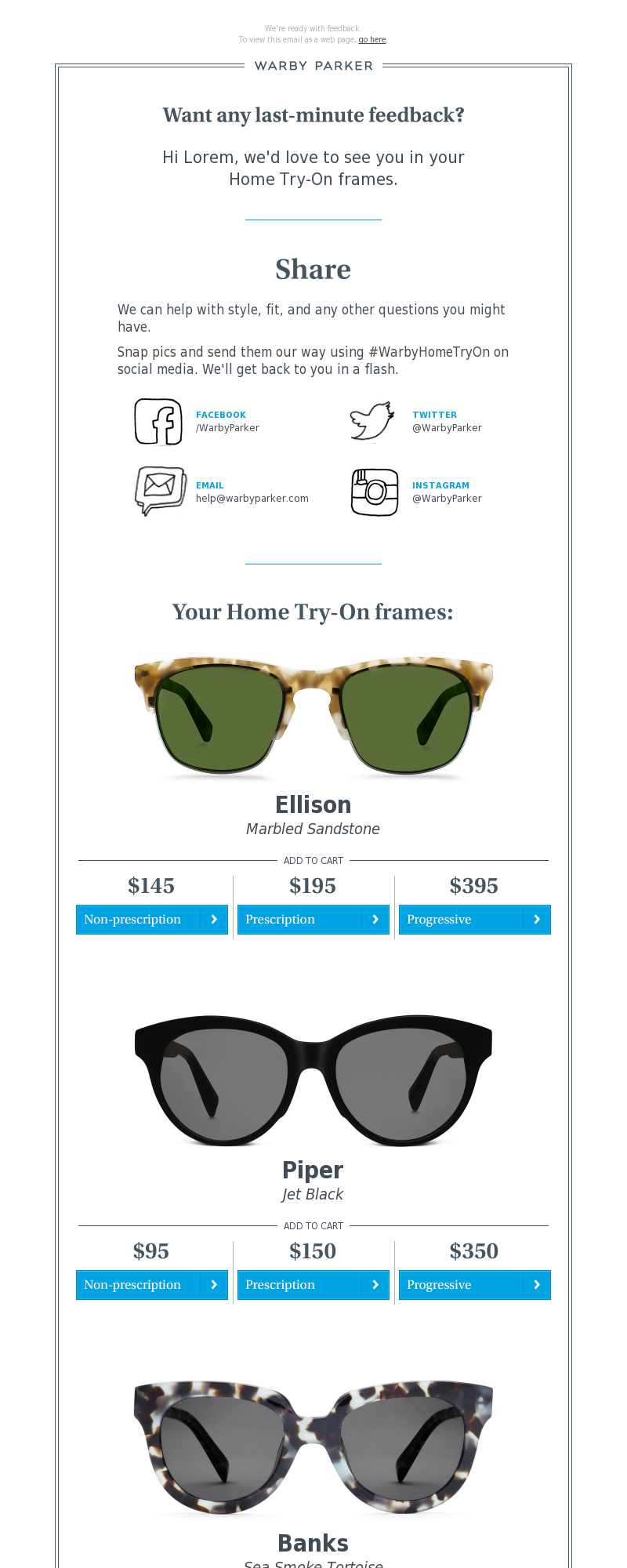
And just one more…
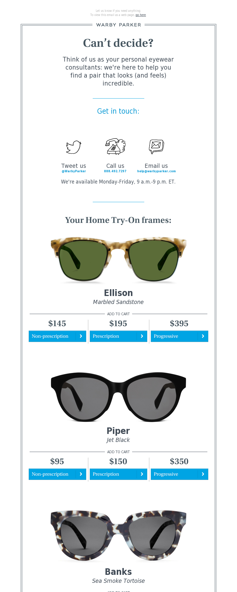
This seems to be the point where Warby Parker really tries to close the deal. And that makes sense — like any good salesperson, they’re paying the most attention when you’re testing out their product for yourself.
The biggest lesson here is probably to strike when the iron is hot. If someone is testing out your product through a free trial or even an at-home try-on kit, that is the best time to try and sell them with a carefully-crafted email sequence. They’ve shown interest in your product, they are trying it out, they are deciding whether they want to keep it, and you should be contacting them consistently during that time. Not in a pushy way, of course, but by offering free advice or free consultation calls, just like Warby Parker does.
Finally, we purchased some sunglasses for the sake of our email marketing research. Here’s the email we received afterwards.
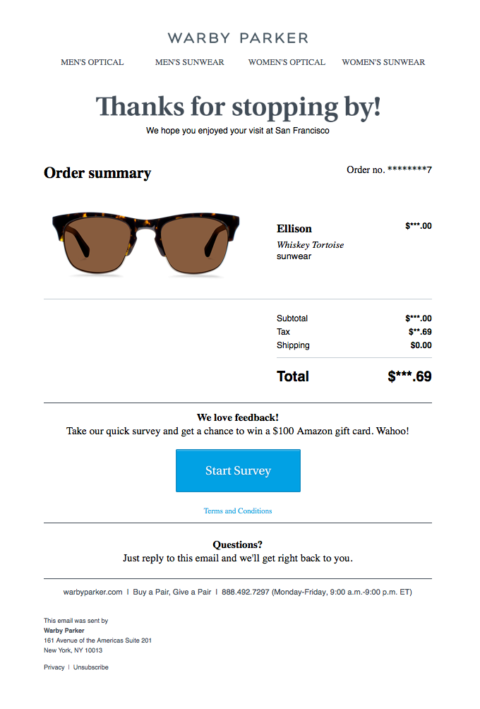
This email is not overly complicated. It thanks the customer for their purchase gives them necessary transactional information, stays on-brand, and tells them that they can get support by just responding to the email. It also encourages the customer to take a survey by offering them a chance to win a $100 Amazon gift card.
It’s a reminder that your confirmation email doesn’t need to be too complex, but it does need to do a few things right if you want repeat customers (which you do).
- Always THANK Your Customers — If they purchased something from you, then you need to say “Thank you.” It’s a polite and humble acknowledgment that you depend on your customers.
- Offer Support — After someone purchases something, they might have questions or thoughts about the product they received. Make it easy for them to contact you and get support if needed. This will help you build long-term customer relationships.
- Get Feedback — The post-purchase email is a great time to collect feedback on your products or customer service. A simple survey or even a 1-5 star-rating system will work wonders.
Download the visualized teardown
Download the Visualised Teardown
Enter your email address to download our one-page visualisation.
We respect your privacy. Unsubscribe at any time.
Conclusion
In the end, Warby Parker is an innovative company that delights its customers by creating compelling email campaigns.
That isn’t the only reason the business has succeeded, of course, but it’s certainly a big one. Warby Parker’s at-home try-on kits, consistent branding and communication, and desire to authentically help their customers is second to none.
This is definitely a company that marketers and entrepreneurs should look to when wanting to learn how to build a successful business.
And we hope this teardown has provided you with important insights.
discuss on twitter