
MasterClass is an online education platform offering video courses taught by renowned experts and celebrities in various fields. These courses cover a wide range of subjects, including writing, cooking, acting, music, business, photography, and more.
In this breakdown, we’ll analyze Masterclass’s Labor Day promo email to uncover key strategies and tactics that make it effective.
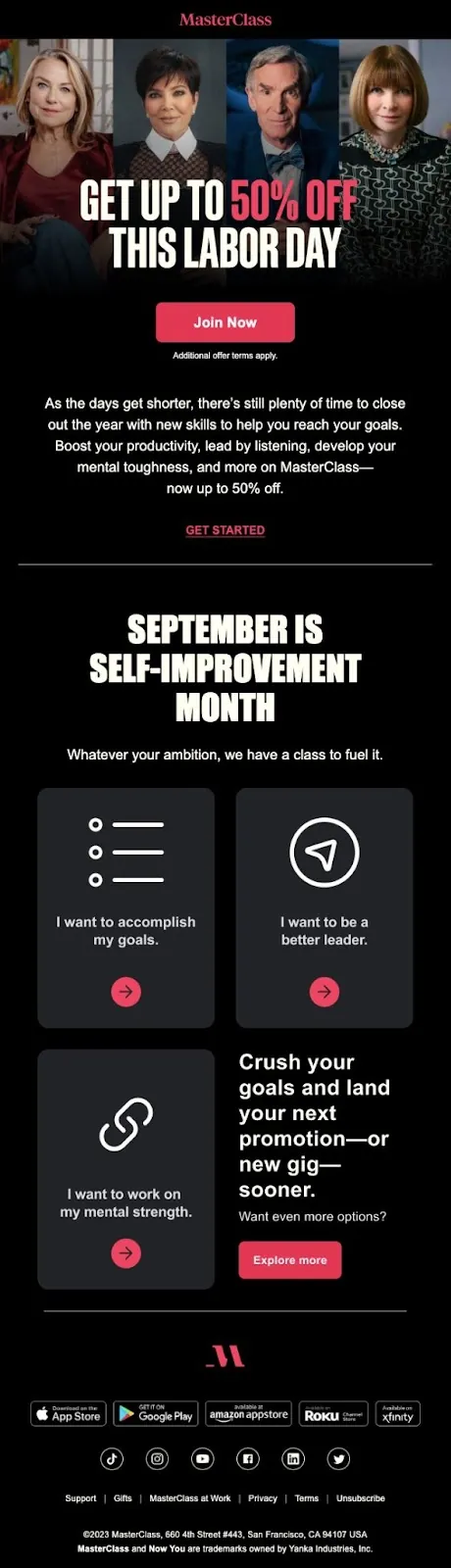
Subject line — “Get up to 50% off this Labor Day”
The subject line “Get up to 50% off this Labor Day” is an effective piece of copy for several reasons. It’s direct and to the point, clearly stating the offer which is a substantial discount of 50%.
By tying the offer to Labor Day, it implies that the discount is not just limited but also linked to a specific, fast-approaching date. This can create a sense of urgency, as recipients may not want to miss out on a limited-time offer, playing on the fear of missing out (FOMO).
It uses a strong action verb “Get,” which is a persuasive trigger in marketing that propels the reader towards taking an action. The inclusion of “up to” serves to set the expectation that while there is a significant discount available, it may vary across different classes or products, which can pique curiosity about what specific deals are available.
The entire phrase is constructed in a way that is clear and easy to understand at a glance. In the fast-paced environment where consumers are bombarded with information and have limited attention spans, clarity is key. A simple, direct message has a greater chance of breaking through the noise.
Ideas For You to Write Effective Subject Lines
Here are some subject line templates for introducing Labor Day offers:
- “Unlock Exclusive Labor Day Savings – Enroll Now!”
- “Labor Day Flash Sale – Courses Half Off!”
- “Don’t Miss Out – Save Big This Labor Day!”
- “Labor Day Deal Alert: Classes Starting at 50% Off!”
- “Final Hours: Your Labor Day Discount Inside!”
- “Labor Day Special: Invest in Learning, Now for Less!”
- “Celebrate Labor Day with a Special Offer Just for You!”
- “Limited Time: Your Labor Day Bonus Awaits!”
- “Make the Most of Labor Day – Special Savings Inside!”
- “Labor Day Savings Encore – Extra Discounts End Soon!”
Section 1: Introducing the Offer
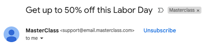
The strategic approach of the email is timely and relevant, leveraging a holiday known for sales and promotions to create an immediate connection with the audience. The Labor Day mention serves as a contextual hook and adds a sense of urgency, suggesting that the offer is temporary and should be acted upon quickly. The strategic placement of well-known personalities in the email not only captures attention but also adds a layer of authority and social proof, subtly informing the recipient that experts of high caliber are behind the MasterClass offerings.
In terms of design, the email is visually striking, featuring a collage of recognizable figures that are likely to resonate with a broad audience. The color palette is carefully chosen — a dark backdrop makes the vibrant text pop out, particularly the red discount offer, ensuring it’s the first thing a reader’s eye lands on.
This visual hierarchy is not accidental. It funnels the viewer’s attention down to the central message and toward the clear call to action.
The copywriting complements the design by being concise and direct. It doesn’t overwhelm with information but rather presents the essential offer clearly. The phrasing “Get up to 50% off this Labor Day” serves multiple functions—it presents the value proposition, ties the offer to a time-sensitive event, and creates a sense of urgency. All of which are potent motivators in the consumer decision-making process.
The call to action “Join Now” is an effective use of imperative language that gives the reader a clear directive on what to do next.
Section 2: Self-Improvement Incentive
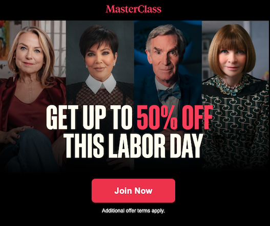
The text in this section of the email is designed to engage and motivate the reader by framing the MasterClass offer within the context of self-improvement and personal development, which is a strong and resonant theme for many.
The opening sentence, “As the days get shorter, there’s still plenty of time to close out the year with new skills to help you reach your goals,” taps into the seasonal change to create a sense of urgency. It’s an emotive way to remind the reader that time is passing and implies that the opportunity to improve oneself should not be missed as the year progresses.
Following this, the benefits are clearly listed — “Boost your productivity, lead by listening, develop your mental toughness, and more on MasterClass.” By directly addressing common aspirations, such as increasing productivity or developing leadership skills, it connects with the reader’s personal goals and ambitions.
The section concludes with a reminder of the promotion, linking these desirable outcomes with the incentive of the discount — “now up to 50% off.” This not only reinforces the value proposition but also connects it back to the urgency implied at the beginning.
The call to action — “GET STARTED,” — is prominently displayed, encapsulating the message’s intent into a direct and immediate action. It’s simple, compelling, and visually distinct, making it easy for the reader to know exactly what to do next.
Section 3: Aspirations to Actions
The header, “SEPTEMBER IS SELF-IMPROVEMENT MONTH,” immediately informs the reader of a thematic focus that’s relevant to virtually everyone. This concept creates a framework within which the rest of the message operates, anchoring the reader’s attention to the idea of growth and advancement.
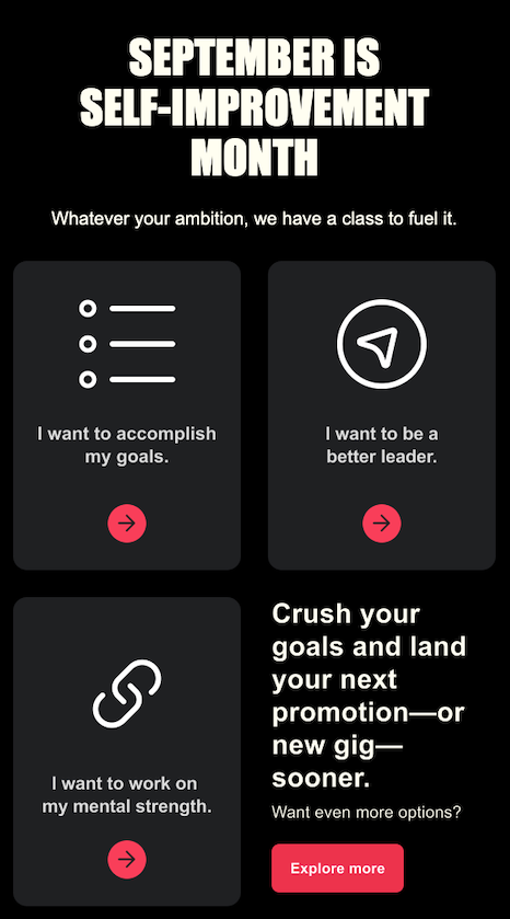
The following text, “Whatever your ambition, we have a class to fuel it,” broadens the appeal, signaling to readers that MasterClass has a diverse range of courses that can cater to various interests and goals. This inclusive message suggests a personalized experience, as it connects the service directly to the reader’s unique ambitions.
The use of icons and short, assertive statements like “I want to accomplish my goals” and “I want to be a better leader” serves two functions. First, it creates an easy-to-scan format that allows readers to quickly identify areas of interest. Second, it encourages readers to envision themselves achieving these specific aspirations, which increases the likelihood of engagement.
The final statement, “Crush your goals and land your next promotion—or new gig—sooner,” adds a layer of immediacy and tangible outcome to the pursuit of self-improvement, linking the MasterClass offerings directly to career advancement, a concrete goal for many.
The “Explore more” button serves as an inviting call to action for readers who may be curious about the full breadth of classes available, beyond the highlighted examples.
Analysis From a Design Perspective
Analyzing the email from a design perspective, we can see a number of principles at work that contribute to its effectiveness:
- Color Scheme and Contrast: The use of brand colors in an email design is a strategic choice that strengthens brand recognition and creates a cohesive brand experience. In the case of MasterClass, the use of red and black serves as a visual signature that subscribers can instantly identify.
- Visual Hierarchy: The design establishes a clear visual hierarchy. The largest text is the promotion (“GET UP TO 50% OFF THIS LABOR DAY”), which is the primary message. Subsequent sections are clearly delineated and use size and color to guide the reader through the email in a logical order.
- Use of Images: The top section features prominent images of instructors, which not only adds credibility (by associating the courses with recognizable experts) but also breaks up the text and adds visual interest.
- White Space: Despite the email being content-rich, there is good use of white space around elements, which prevents the design from becoming overwhelming and allows each section to breathe. This makes for a more pleasant reading experience and helps to guide the eye through the content.
- Consistency: The design elements are consistent throughout the email. Font choices, colors, and button styles are uniform, which creates a cohesive look and feel. This consistency also reinforces brand identity.
- Typography: The typography is clear and legible with varied font sizes used to denote importance and to guide the reader’s eye to the most important information first. The bold, capitalized font for “SEPTEMBER IS SELF-IMPROVEMENT MONTH” acts as a title for the section, setting the stage for the content that follows.
- Iconography: The use of icons in the second part of the email provides a quick visual representation of the benefits or topics of the courses. Icons are simple and universally recognizable, aiding in quick comprehension and adding to the visual appeal.
Potential Area For Improvement
Their copy & design game is quite robust. The strategic use of brand colors, a clear call to action, and the clever use of icons and images form a strong foundation. However, like any well-crafted piece, there is always room for a touch-up or two.
Diving into the finer details, one suggestion stands out for taking this already solid design to the next level: Enhancing personalization.
MasterClass already sets the bar high with its design, but what if it could speak directly to you? Imagine opening this email to find suggestions tailored just for your interests. A touch of personalization could transform a good campaign into a great one, ensuring that subscribers feel seen and understood. Integrating user data to customize content could significantly lift engagement, as subscribers find themselves face-to-face with courses that seem handpicked for them.
10 Takeaways For Email Marketers From Masterclass Labor Day Promo Email
MasterClass’s Labor Day promotional email provides valuable lessons for email marketers looking to craft compelling campaigns. Here are ten takeaways that stand out:
- Leverage Brand Colors: MasterClass’s use of red and black, their signature brand colors, creates instant recognition and establishes a strong visual identity.
- Clarity is Key: The email communicates its main message—”Get up to 50% off this Labor Day”—loud and clear, ensuring the promotion is understood at first glance.
- Create Urgency: By mentioning a specific holiday, the email successfully creates a sense of urgency, prompting quick action.
- Employ Powerful Imagery: Featuring images of well-known instructors not only adds credibility but also personalizes the experience, as these faces may resonate with different audience segments.
- Incentivize with Value: A significant discount like “50% off” is a strong incentive that is likely to encourage clicks and conversions.
- Use Strategic Calls-to-Action (CTAs): Clear and prominent CTAs guide users on what to do next, an essential element for driving engagement.
- Keep It Concise: The email is direct and to the point, making it effective for readers who have a limited attention span.
- Utilize Visual Hierarchy: The design directs the reader’s eye through the use of varying text sizes and images, from the main offer to secondary calls to action.
- Align With Seasonal Events: Tying the promotion to an event like Labor Day gives the campaign a timely hook that can boost relevance and interest.
- Highlight the Offer’s Value Proposition: The email doesn’t just promote a discount; it ties the promotion to the value of self-improvement, aligning with the customer’s personal goals and the seasonality of “Self-Improvement Month.”
These takeaways can serve as guidelines for email marketers aiming to design emails that are not only visually appealing but also strategically sound, fostering engagement and driving conversions.