
Sunsama is a daily planner app designed to help individuals and teams organize their tasks and calendars to achieve a better work-life balance. It stands out for its guided daily planning process, allowing users to review completed tasks, plan for the next day, and prioritize tasks effectively.
In this breakdown, we’ll analyze Sunsama’s referral email to uncover key strategies and tactics that make it effective.
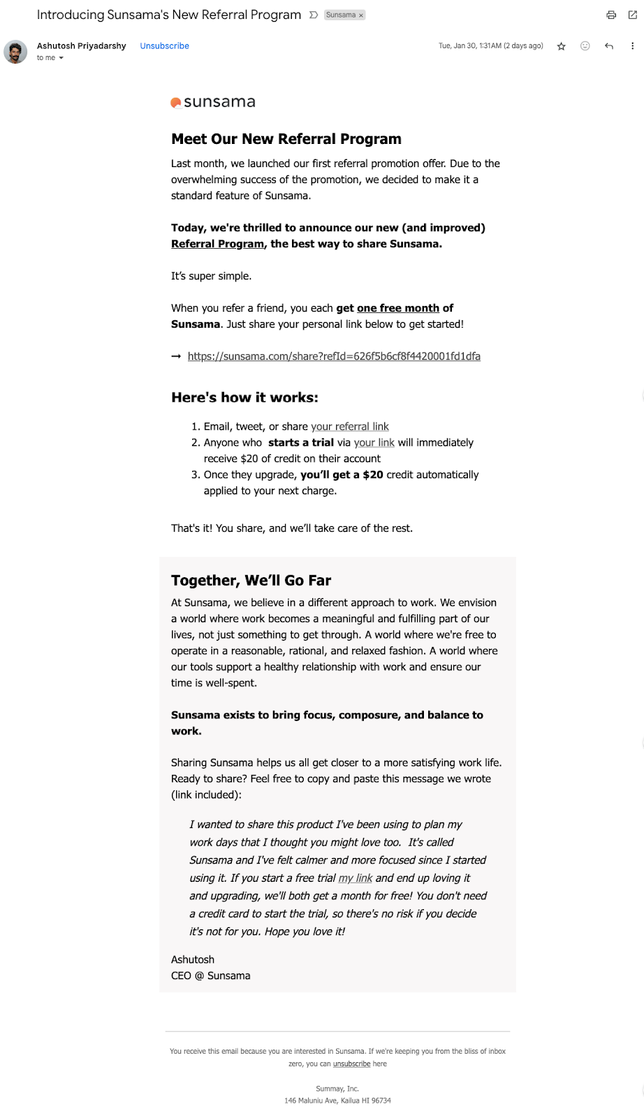
Subject line — “Introducing Sunsama’s New Referral Program”
First of all, this email comes directly from a company’s founder. It carries a sense of importance and urgency. It can make the recipient feel like they are being personally addressed, which can increase the likelihood of the email being opened.
The subject line in the email is effective for several reasons:
- Clarity: It tells the recipient exactly what the email is about without any ambiguity.
- Relevance: It introduces something new, which can pique the recipient’s interest since people are often curious about updates or new opportunities.
- Branding: It includes the name of the company or product, which is good for brand recognition.
- Value Proposition: By stating that it’s a referral program, it implies that there is a potential benefit for the reader to be had, which encourages opening the email to find out more.
Observe the founder’s picture beside the subject line.
It adds a personal touch to the email, making it more engaging. This can be particularly effective in messages from company leaders because it puts a face to the name, which can help build trust and connection with the audience.
Ideas For You to Write Effective Subject Lines
Here are some subject line templates for introducing referral programs:
- “Unlock Exclusive Rewards: Join Our Referral Club!”
- “Invite Friends, Earn Rewards – Start with Our Referral Program!”
- “Get [Reward] for Every Friend You Refer!”
- “Spread the Word: New Referral Bonuses Await!”
- “[First Name], Give $20, Get $20 – Refer a Friend Today!”
- “Your Network is Your Net Worth – Refer and Earn!”
- “Introducing Our ‘Share the Love’ Referral Program!”
- “Exclusive Offer: Help Friends Discover [Product/Service] and Get Rewarded!”
- “Friends Make Life Richer – So Do Our Referral Rewards!”
- “Give the Gift of [Product/Service] – Get a Thank-You Reward!”
Section 1: Introducing the Program
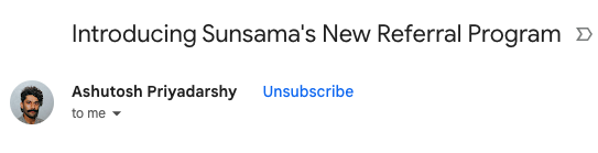
It starts by referencing a previous event—last month’s launch of a referral program, and then builds on that by announcing an improved version. This approach effectively creates a narrative, suggesting progress and continuity which can reassure readers that the product or service is evolving positively.
The announcement is made to sound exclusive and special by using words like “thrilled” and “new and improved.” This language is chosen to generate excitement and interest. The simplicity of the program is emphasized, which can be reassuring to potential participants who might worry about a complicated process.
The email speaks directly to the reader using “we” and “you,” which helps to create a connection with the audience. The message is concise, clearly stating the purpose without any unnecessary information, which respects the reader’s time and attention.
Another key element here is the immediate reward offer—mentioning “one free month of Sunsama” is a concrete incentive, and placing this early in the email ensures it captures attention.
This section teaches the importance of connecting with the audience by referencing shared history, creating enthusiasm with positive language, simplifying the participation process, and quickly presenting a tangible benefit. The combination of these elements can make an email more compelling and more likely to convert readers into participants in the referral program.
From a design perspective, the larger, bold type for the announcement makes it stand out and serves as a clear heading, structuring the content for easier reading.
Section 2: Mechanics of the Referral
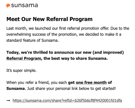
This section lays out the process in a simple, step-by-step format, which helps to demystify how the referral program works and what is expected of the participant.
It’s effective because it breaks down the participation process into three simple steps. The use of ordinal numbers (1, 2, 3) guides the reader through the sequence of actions required, implying ease and accessibility.
What someone can learn from this is the power of simplicity and clarity. The instructions are straightforward, removing any potential confusion about what is expected of the reader. Key actions and benefits are highlighted in bold, which draws the eye and emphasizes the important aspects of the program—starting a trial, the immediate reward, and the subsequent benefit upon upgrading.
The language “That’s it! You share, and we’ll take care of the rest.” serves as a reassuring conclusion, suggesting that the company values the user’s effort and will handle the finer details, which can further incentivize action.
By making the process seem as effortless as possible and highlighting the incentives, this section effectively encourages participation while minimizing perceived effort, a key technique in driving engagement.
Section 3: Message from the CEO
This section communicates the company’s ethos and provides a personal touch from the CEO.
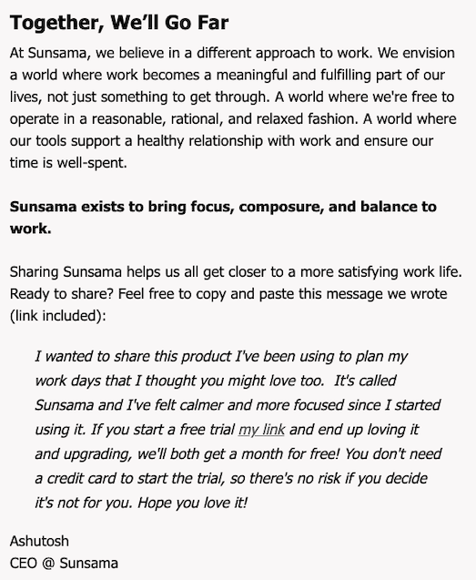
First, it reaffirms the company’s core values and mission, framing Sunsama not just as a tool, but as a partner in achieving a balanced, focused work life. This is not just about selling a product; it’s about inviting the reader to be part of a movement that champions a healthier work philosophy. It’s a strategic way of creating a deeper connection with the audience.
Then there’s a shift to a more personal tone with the CEO’s direct message, which serves as a template for the user to share with friends. This is strategic because it does three things:
- Lends Credibility: Coming from the CEO, it adds weight to the message.
- Facilitates Sharing: By providing a pre-written message, it removes the barrier of crafting a message, making it easy to share.
- Highlights Risk-Free Trial: Emphasizing the no-credit-card-needed aspect and the benefit of mutual rewards reduces the perceived risk and can encourage trials and subsequent referrals.
It’s also important to note the strategic placement of this section at the end of the email, leaving the reader with a compelling call to action after having explained the referral program details. The personal endorsement and crafted message for sharing encapsulate the email’s purpose: to motivate the reader to become an active participant in the referral program, leveraging the trust they have in the company and its leadership.
Analysis From a Design Perspective
From this email, designers can learn the importance of brand consistency, visual hierarchy, and the power of simplicity in design. Each element serves a purpose and contributes to the overall goal of the email – to inform and persuade the reader to engage with the new referral program.
- Typography: The email uses different font sizes and bold text to create a hierarchy of information, making it easy for readers to scan through the key points.
- Spacing: Adequate spacing between lines and paragraphs improves readability. The design doesn’t feel cramped, which allows the reader to easily navigate through the content.
- Visual Flow: The layout directs the reader’s flow from the top to the bottom in a logical sequence – starting with the announcement, explaining the process, and ending with a call to action.
- Simplicity: The design is straightforward with minimal use of different colors or fonts, which keeps the reader’s focus on the message rather than on the design elements.
Finally, the separate box around the message from the CEO serves a strategic purpose.
It visually distinguishes this section from the rest of the content, signaling that it holds a personal message, different from the informational content above. This design choice can draw the reader’s attention and give the closing remarks more weight, as personal messages may be perceived as more sincere and less automated.
Potential Areas For Improvement
While the email is well-structured, there are always areas that could be considered for improvement to optimize engagement and clarity:
- Actionable Steps Visualization: The referral steps mentioned could be accompanied by icons or a simple infographic. Visual representation of steps can sometimes be processed quicker than text, making it easier for users to understand what is expected.
- Separation of Sections: While the CEO’s message is in a separate box, similar visual separation for the initial explanation and the steps of the referral program could help in guiding the reader through the email in a more organized manner.
- Social Sharing Integration: Direct links or buttons for sharing on social media platforms could be added to make it easier for recipients to spread the word. This could increase the participation rate in the referral program.
- Footer Information: The footer is quite plain and could include more useful links, such as a link to FAQs about the referral program, customer support, or even a link to the company blog for further engagement.
- Consistent Branding in the Body Text: The branding in the body of the email is minimal. Incorporating subtle brand elements, like a watermark or a footer design that echoes the header’s color, could reinforce brand identity.
- CTA Button for Referral Link: Instead of a hyperlink for the referral URL, a button that says “Start Referring Now” or “Send My Referral” could be more inviting and increase the likelihood of clicks.
10 Takeaways For Email Marketers From Sunsama’s Referral Email
- Start with a compelling subject line that hints at new opportunities or offerings to grab attention from the get-go.
- Use the header of the email to convey the most important message — if it’s about a new program, make sure that stands out immediately.
- Keep the language simple and direct to ensure the message is understood quickly and easily by all readers.
- Outline the benefits early on in the email to entice readers; showing the value proposition upfront can motivate further reading and engagement.
- Break down processes into numbered steps to clarify the action needed and to visually organize information for the reader.
- Highlight key actions or benefits by using different font weights or colors to draw the reader’s eye to the most important parts.
- Include a personal touch, such as a note from the CEO, to build a rapport and add authenticity to the email.
- Provide ready-to-use referral messages or social posts within the email to make sharing as frictionless as possible.
- Ensure the call to action is clear and easy to find; don’t hide the link or button that you want the reader to click.
- Use whitespace effectively to avoid overwhelming the reader, keeping the design clean and focused on the content.