
Teachable is a renowned online platform that enables entrepreneurs and businesses to create and sell their own online courses. It’s a powerful tool for educators and creatives looking to monetize their knowledge and skills. As a leader in the e-learning industry, Teachable’s marketing strategies offer valuable insights for businesses of all sizes.
In this breakdown, we’ll analyze Teachable’s BFCM promotional email to uncover key strategies and tactics that make it effective.
Black Friday Cyber Monday, commonly abbreviated as BFCM, represents one of the biggest shopping events of the year. It marks a period where consumers are actively looking for deals, and businesses, in turn, ramp up their marketing efforts to capture this heightened interest.
Whether you’re a seasoned email marketer or new to the field, this analysis will provide practical insights and takeaways that can be applied to your own email marketing campaigns, especially during high-stakes sales events like BFCM.
Subject line
This subject line is a model of clarity and brevity. In fewer than ten words, Teachable conveys the offer’s essence without unnecessary fluff. This brevity is crucial in the mobile-first world where screen real estate is limited, and attention spans are short.
Let’s understand what else makes it effective to improve open rates.
Urgency
Teachable’s subject line creates an immediate sense of urgency. The phrase “expires soon” signals a limited time offer, propelling subscribers to act swiftly to capitalize on the savings. Urgency is a time-tested driver in marketing, tapping into the innate human fear of missing out on a beneficial opportunity.
The incentive
Right at the outset, the subject line presents the value proposition—a generous 40% discount. This isn’t just any offer; it’s a significant saving on Teachable’s Pro plan, which is likely to attract anyone who’s been considering an upgrade. By stating the offer upfront, Teachable ensures that the message reaches those for whom the deal holds relevance, thus improving the chances of engagement.
Use of emojis
Teachable’s subject line doesn’t stop at words; it includes a visual cue—a pair of alarm clock emojis. While seemingly simple, these emojis serve a dual purpose. Firstly, they break the monotony of text, making the email stand out in a cluttered inbox. Secondly, they reinforce the message of urgency non-verbally.
How can you write such effective subject lines?
The subject line Teachable employs can be distilled into a template for you to emulate:
- “[Percentage] off [Product/Service] ends soon [Urgency-Inducing Emoji]”
- Last Chance: Save [Percentage] on [Product/Service] Today! ⏳
- Hurry, [Name]! Your [Percentage] Off Coupon Expires Midnight! 🕛
- Exclusive Offer: [Percentage] Discount Just for You, [Name]! 🌟
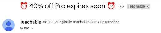
Section 1: Brand Identity and Choice Presentation
The email starts with the Teachable logo, which is good for brand recognition. Immediately below, a bold, contrasting color banner with “BLACK FRIDAY SAVINGS” draws attention to the sale.
The headline “Choose Basic or go Pro?” is clear, concise, and presents the reader with a direct choice, which is an effective strategy to prompt decision-making.
The use of subheadings like “Let’s help you decide” is inviting and suggests that Teachable is providing guidance, which can be comforting and helpful for potential customers. The downwards arrow alongside this acts as a visual cue for the reader to scroll down, serving as an implicit call to action.
The high-quality image of a person actively engaged in what appears to be a woodworking project resonates with the target audience of course creators, who may see themselves in the image of someone meticulously creating something valuable. It taps into the aspirations of potential course creators, making the marketing message more relatable and inspiring.
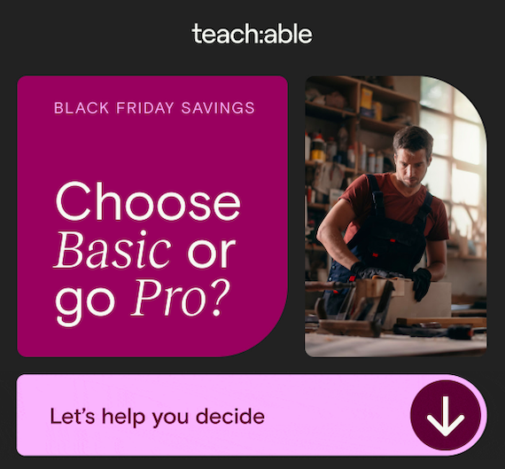
Section 2: Plan Comparison and Value Highlight
This section is designed to facilitate decision-making by presenting information clearly and with a strong emphasis on the value and savings associated with each plan.
Information is organized in a table-like structure, which is effective for side-by-side comparison, allowing readers to easily weigh their options. Checkmarks and crosses provide an instant visual cue about the availability of features, making it easy to scan.
Phrases like “Low transaction fees” and “0% transaction fees” are specific and transactional, likely appealing to users who are cost-conscious and focused on profit margins.
Section 3: Bonus Value Proposition
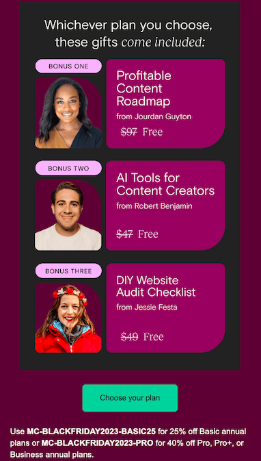
The section of the Teachable email provided focuses on the bonus gifts included with either the Basic or Pro plan.
It increases the perceived value of the offer by showing that customers will get more than just the main product—they’re also receiving extra resources that can help them succeed. By aligning these bonuses with the Black Friday deal, it implies that they are limited-time offers, adding a sense of urgency and scarcity which can prompt immediate action.
The copy is straightforward and clearly states the value of each bonus item, emphasizing the transition from a cost to a free addition upon choosing a plan.
The word “Free” is written in a font that catches the eye. The original prices crossed out next to the word “Free” provide a reference point, making the offer seem even more valuable.
The design uses size and color to create a hierarchy, drawing the eye from the title to the individual bonuses, and then to the ‘Choose your plan’ call to action.
People often scan emails rather than read every word. The bold titles, images of the creators, and the clear differentiation between the bonuses make it easy to scan and understand the offer quickly.
The bright color of the CTA button stands out against the darker background. This is a common practice to draw the user’s eye directly to the action the email wants them to take.
The email provides specific discount codes for the Black Friday sale. This gives a clear next step for users who decide to take action, ensuring they understand how to avail the offer.
By providing the codes right in the email, the brand simplifies the process for the user, likely increasing the conversion rate as the customers can easily apply these codes at checkout without having to remember them or write them down.
Footer
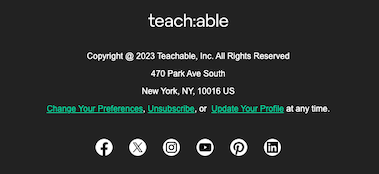
Teachable’s footer is minimalistic and functional, adhering to the company’s branding.
The inclusion of a physical address not only meets legal requirements for business communication but also adds a level of trust and authenticity to the brand. The links “Change Your Preferences,” “Unsubscribe,” and “Update Your Profile” are essential for allowing recipients to manage how they interact with Teachable’s communications.
Various social media icons (Facebook, Twitter, Instagram, YouTube, Pinterest, LinkedIn) suggest Teachable’s omni-channel presence and offer recipients multiple platforms to engage with the brand.
Despite the compact space, the footer is not cluttered; it leaves enough room around the links and icons to allow for easy clicking, which is considerate of user experience, especially on mobile devices.
Potential areas for improvement:
- For some readers, the amount of text and number of choices presented might be overwhelming. The balance between text, images, and whitespace could be revisited to ensure that the email is easy to read and navigate. This might include adjusting the size of the images or the spacing between sections.
- The use of magenta and purple is striking, but to maintain brand integrity, the design should incorporate Teachable’s actual brand colors. For instance, different shades of green could be used for the background or to highlight key information.
- Depending on the capabilities of their email system, Teachable could look to segment their audience and personalize the bonuses or messaging based on the user’s history or preferences.
10 takeaways for email marketers from Teachable’s BFCM email
- Use clear, concise subject lines with less than ten words, focusing on the offer’s essence to improve open rates, especially important in mobile-first contexts.
- Create urgency in your subject lines, like using phrases such as “expires soon” to invoke a fear of missing out and prompt quick action.
- Present the value proposition upfront in the subject line, such as a significant discount or offer, to attract relevant audiences and enhance engagement.
- Include visual cues like emojis in the subject line to break text monotony and reinforce the message, making the email stand out in a cluttered inbox.
- Use a strong visual hierarchy in the email body, like bold colors, contrasting banners, and clear headlines, to guide the reader and prompt decision-making.
- Organize information in a clear, comparative format, like a table structure with checkmarks and crosses, to facilitate easy decision-making for the reader.
- Enhance perceived value by including bonus gifts with the main offer, emphasizing their added benefits and limited availability to create a sense of urgency.
- Make the email scannable with bold titles, clear images, and distinct sections, as people often skim through emails rather than read every word.
- Use a bright, attention-grabbing color for Call-To-Action (CTA) buttons, ensuring they stand out and draw the user’s eye to the desired action.
- Include essential elements like discount codes, unsubscribe links, and social media icons in the footer, making it functional yet adhering to brand identity and legal requirements.
Wrap Up
As you reflect on these takeaways, we encourage you to think about how these strategies can be adapted and applied to your own email campaigns. Experiment with urgency, clarity, and value in your messaging, and observe the impact on your audience engagement and conversion rates.
The key to successful email marketing lies in continuous learning and adaptation. So take these insights, apply them creatively to your context, and watch your email marketing performance improve.