Near the end of 2012, Slack — a team communication tool — was in the works. And by March of 2013, the creators of Slack were using it for their own team communication. By the time that 2013 rolled around, Slack was ready to get more teams using the app — which is easier said than done, of course. When you need to convince individuals to use a service, that is one thing. When you need to convince an entire team, that is something else altogether.
So they did what any new startup founders would do: “We begged and cajoled our friends at other companies to try it out and give us feedback.”
Eventually, they got close to 10 companies to agree to trying their product out. The next few years included getting user feedback, adapting, getting more feedback, and adapting again — an iterative process that the founders attribute most of their success to.
“We started inviting teams in batches and watched what happened. Then we made some changes, watched what happened, made some more changes…”
Now, the company has about 9 million weekly users, more than 1,600 employees, and is valued at about $7.1 billion.
Clearly, the company is doing something right. And we thought that analyzing their email campaigns might help other marketers like yourself better understand how big, successful startups use email marketing to delight customers and build long-lasting relationships.
So we subscribed to their email list and triggered everything we could. Here’s what we learned.
Slack’s Welcome Email
The first email that we received from Slack after we signed up was a prompt to confirm our email address. Here’s what that email looks like.
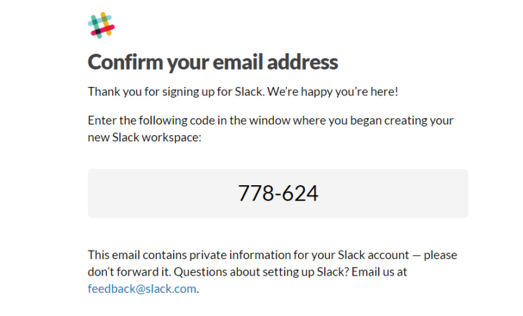
In a lot of ways, this email is very basic. But it also does those basic things very well (and if you’re just gonna do the bare-minimum, might as well make it perfect!). First, Slack’s “Confirm your email address” email has the company’s logo in the upper left corner, as they do with all of their emails. This ensures that their audience immediately recognizes the Slack brand and which emails are from Slack. Second, the emails thanks the subscriber for signing up — don’t ignore the power of thanking your subscribers when they join your email list. A simple “thank you” goes a long way toward making the subscriber feel like they’re not just another statistic in your database and it opens them up to connecting with your brand.
Notice, too, that this “Confirm your email address” email doesn’t give the subscriber anything to do other than confirm their email address. And that’s important. Because until someone confirms their email address, they can’t be added to Slack’s email list — at this point in the subscriber’s journey, that is the only thing that matters. You can provide them with additional content, resources, and coupons once they confirm their email address, but don’t rush it or you might unintentionally distract a valuable subscriber from confirming their subscription.
After we confirmed our email address, we received Slack’s official Welcome Email. Here’s what it looked like.
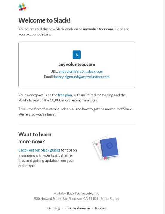
Compared to most of the other email marketing campaigns we analyze in the Teardowns section of our website, Slack keeps things quite simple. Slack’s emails never require you to scroll to get to the bottom of the email, they always have a specific reason for reaching out, and they are almost never sales-y about it. Their welcome email is no different.
They welcome the new user (since, for Slack, subscribing to their email list means you also signed up for the free version of their software), provide account details, and tell you what to expect over the next few days (i.e. “This is the first of several quick emails on how to get the most out of Slack”).
Then, at the end of the email, they provide a link to some of their free Slack guides which have tips for communicating with team members, integrating Slack with other tools, and sharing files.
That’s it — plain and simple. Their messaging is clear, their branding is extremely consistent, and their voice is business casual. Slack has an attitude of “I know why I sent this email and once I’ve said what I need to say, I’ll leave you to it.” In the busy business world they serve, that’s a refreshing undertone.
Slack’s Onboarding Emails
After receiving Slack’s “Confirm your email address” and “Welcome” emails, the subscriber receives 5 emails which act as a sort of onboarding sequence.
Here’s the first of those 5 emails that we received.
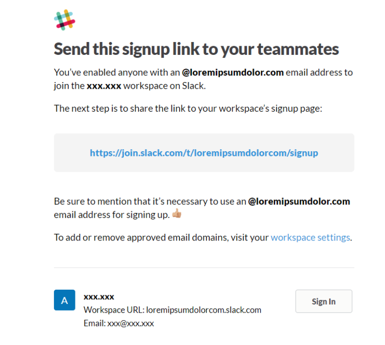
We received this email just a few seconds after the Welcome email.
Again, we see Slack’s logo in the upper left corner. This is the case for all of their emails, which helps to build brand familiarity and set subscriber expectations. Then, they have a to-the-point heading (“Send this signup link to your teammates), as with every email they send. Under different circumstances, this tone of voice might come off a little abrasive to their audience. But Slack’s playful brand colors and laid-back font balance the directness of their language, creating a rather pleasant and casual (but clear) experience.
It makes perfect sense that this is one of the first emails that Slack would send new subscribers. Since their service depends on team collaboration (one person can’t really use Slack on their own), it’s safe to assume that the user signed up either because they need to join an existing workspace or because they need to create a new workspace. One of Slack’s first priorities, therefore, is to encourage new users to invite their friends and coworkers — a smart move coming from a service that depends on team collaboration. Other SaaS companies should take note.
In fact, getting users to invite friends and coworkers is such an important goalpost for Slack’s success that they dedicate the next two onboarding emails to this topic. 
There’s not much to discuss here. The email is dead-simple, well-branded, and has a clear and concise CTA which encourages new users to invite their team members.
Sometimes, in email marketing, simplicity is best.
Here’s the next email which has the same goal of getting users to invite their friends. It has the subject line, “Reminder: Invite People To Slack.”

It’s not until the fourth email of Slack’s onboarding sequence that we received content which wasn’t trying to get us to invite our friends. However, it’s important to note that this series of emails prompting us to add our team members might have been triggered by the fact that we didn’t actually add any team members. In other words, someone who clicked and invited their friends on the first email may not have received the second and third emails with similar CTAs. That would probably be ideal (so you’re not nagging someone to do something that they’ve already done).
Whatever the case, we did receive those emails and we felt it was important to include them here.
Here’s the next email we received from Slack’s onboarding sequence, which encourages us to get the Slack app.
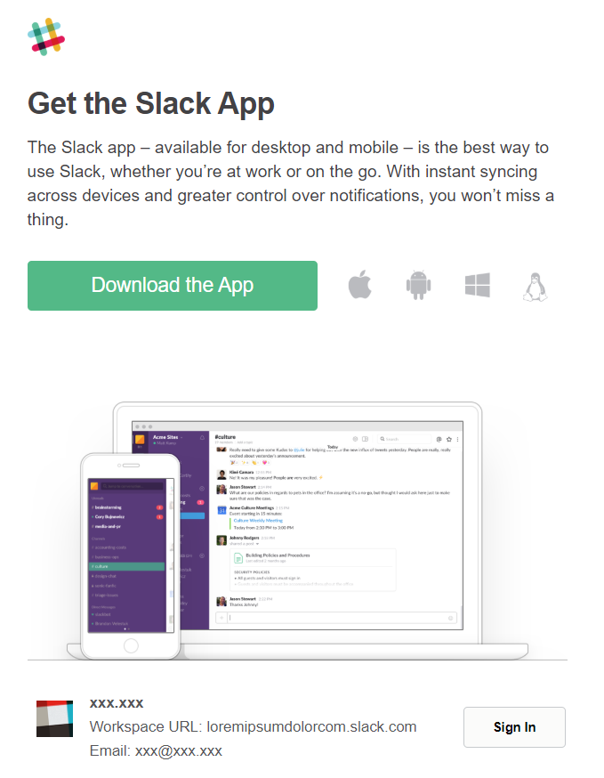
The above email has all of the standard Slack brand identifiers and then it has a CTA to download the Slack app, which is supported on practically every type of device there is.
But why is this such an important step in the user’s experience?
If you’ve ever used Slack before, then you know that it’s a company with a massive focus on user experience, which is one of the reasons they’re so successful. And this onboarding email which prompts new users to download the Slack app does so in an effort to provide people with the best possible experience. The better experience that Slack’s customers have, the more people who will talk about it with their friends, and the more people who will use it in the future (as is true for most software-based businesses).
Also notice the image within this email and how the colors of the image fit with Slack’s business-casual, clear-cut brand personality. Having a continuity of experience between design, colors, fonts, and logo is something that Slack excels at.
The final email of Slack’s onboarding sequence includes a CTA to turn on notifications so that you can “stay focused without missing important messages” — perhaps the biggest crux for most Slack users.
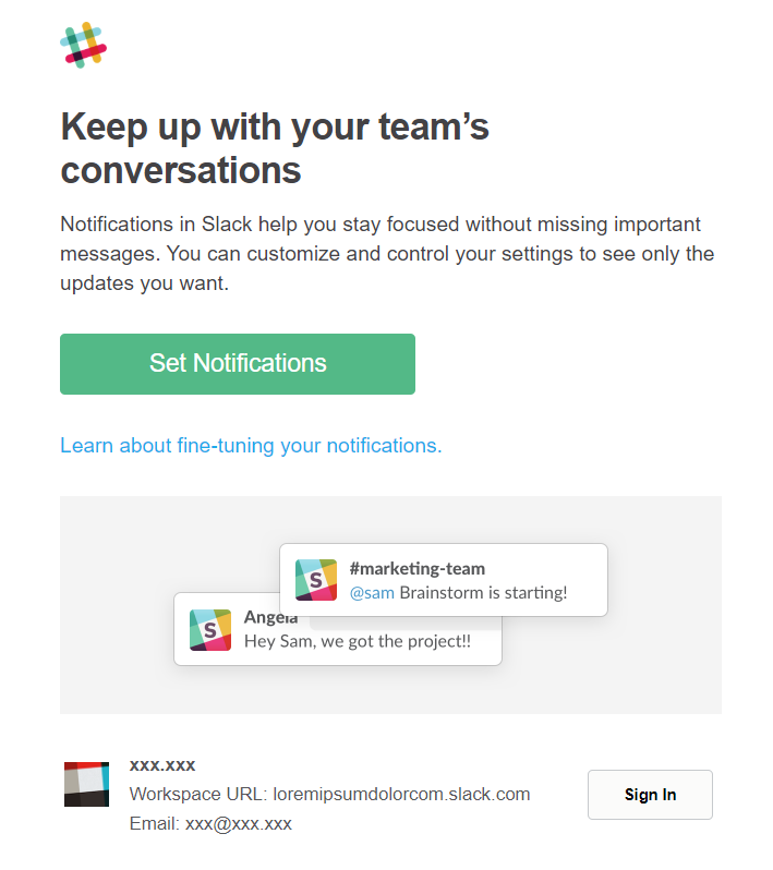
At first glance, this is just another email in Slack’s semi-basic onboarding sequence. They’re just inviting the user to update notifications like practically every other app in the online universe does. But there’s an important caveat here that makes this one of Slack’s most powerful emails.
You see, perhaps the biggest challenge that Slack’s customers face is the ability to focus on work while having a messaging app open on their computer and/or phone. Social media platforms are distracting enough, and as many Slack users have found, so too are work communication platforms. To illustrate what we mean, imagine that you’re trying to focus on a project in your office, but people keep stopping in and saying “Hi” without knocking. You’re going to keep getting distracted!
If used carelessly, Slack notifications can work a little like that. You’ll be in the middle of a big project — at the peak of your productivity — when your notifications start dinging with new to-dos, questions, and funny water-cooler gifs.
And while that’s all fun and games in the beginning, it can be bad enough for business that users opt for other, less distracting communication platforms.
It seems to me that this onboarding email is Slack’s first attempt to navigate this user experience challenge. Because Slack doesn’t just allow users to turn on notifications, but they allow users to manage when and how they receive notifications so that the app doesn’t become a productivity killer. By addressing this problem up front (rather than trying to avoid the problem), Slack has likely improved the experience for many of its users and increased overall retention.
Slack’s Email Cadence
Other than Slack’s welcome and onboarding email campaigns, there’s not a whole lot going on, especially if you consider the hordes of emails that many online businesses send.
And that’s a noteworthy tendency.
Why does Slack send so few emails when many online companies are sending more emails, not less? We can only guess, of course. But if we think about it, in a world where people are receiving more email than ever before, there are really only two ways to stand out (in terms of emailing cadence).
The first way is to send more emails than most companies. By doing this, more people see your emails and you’re practically unavoidable. This isn’t a bad strategy and can work well if you have the right brand image for it.
The other way is to send less emails than everyone else so that the emails you do send stand out in the subscriber’s cluttered inbox. Consider this: what stands out in a person’s inbox more? A long series of emails sent from Company A or a single weekly or bi-weekly email sent from Company B? Of course! Company B will stand out more simply because they send less emails.
(Of course, using that strategy, it’s important to make sure the emails you do send are very high quality).
My point is that, in a world where many marketers believe sending tons of email is the only way to go, Slack — a company that sends very little email — is thriving. You can go either way. The important thing is that you’re consistent and that you emailing cadence fits naturally with your brand image.
Now, Slack does send one note-worthy email to ongoing users. To the owners of workspaces, for example, they send weekly updates. Here’s what that looks like.
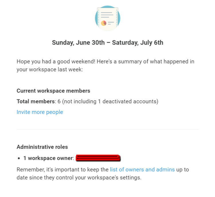
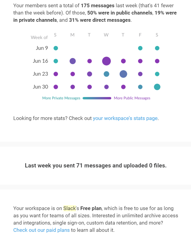
They send this email every week. As you can see, it includes an update on the number of members in your workspace, the number of messages sent in the last week (and how many of those were private vs. public). It also provides a link to more detailed stats about your workspace and reminds you of which plan you’re on at the bottom of the email.
This weekly email is important to Slack users who own businesses (their primary user). It helps the business owner keep tabs on how their employees are communicating (without micro-managing communication) and it makes them feel more in-control. Most business owners love data and stats about their business, so this is a smart move on Slack’s part.
Conclusion
Perhaps the most important thing we learn from Slack’s email marketing efforts is that simplicity can go a long way. Creating an effective and powerful email marketing process doesn’t always mean creating a complicated process. Slack is one such company that has a remarkably basic and simple email strategy, but a very effective one.
Each email they send is branded with the same logo, colors, and font. Slack’s business-casual tone of voice connects with their audience. And they never send an email that doesn’t have a clear and to-the-point purpose.
Every marketer could learn something valuable from Slack’s simple but effective email marketing strategy.
