What can you learn about email marketing from a SaaS business that helps its users be more mindful?
As it turns out, a lot.
In 2010, Headspace launched with a simple but ambitious mission: “to improve the health and happiness of the world.”
Headspace accomplishes that through its app that offers guided meditation, sleep sessions, exercise sessions, and more.
And while meditation apps weren’t popular, Headspace has been credited with catapulting the “meditation industry” into a golden age of profitability.
The app has been downloaded by more than 31 million users and they now have annual revenue of more than $50 million.
Clearly, Headspace’s marketers are doing something right.
But what we’re most interested in is how Headspace uses email marketing to generate leads, convert customers, and build a winning brand.
So we signed up to their email list, tracked everything we received, and documented it below.
Let’s start with lead generation.
Headspace’s Lead Generation
If you go to Headspace’s website, you’ll quickly discover that there is only one CTA: ‘Start free trial’

That’s a bit unusual in today’s world.
Most businesses have lots of different CTAs depending on where you arrive on their website. Blog posts will have content upgrades. Landing pages will have free downloadable lead magnets. And every page will have a “Subscribe To Our Newsletter” opt-in form.
But Headspace?
Nope.
Just that free trial CTA everywhere you go.
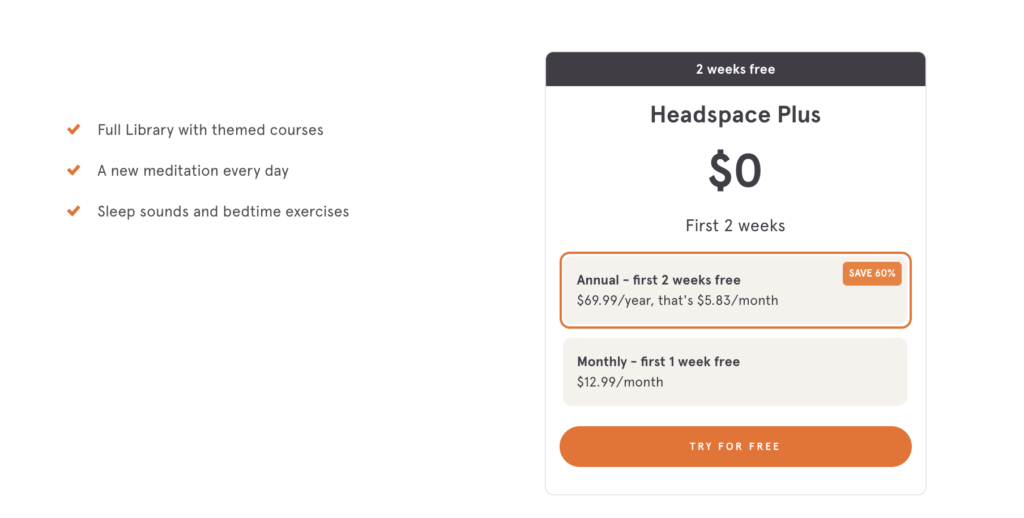
But that could be one of the reasons that Headspace has been so successful. Rather than trying to create loads of different resources and lead magnets, they’ve instead decided to lead with their product. And since they offer a free trial… well, that already is a pretty good incentive(not to mention that it automatically pre-qualifies all of their subscribers).
With all of Headspace’s Facebook ads, they also almost always lead with product…

The lesson here is to not over-complicate your lead-gen process.
If you can offer a free trial of your product, then you might consider doing so as a site-wide lead magnet.
It’ll pre-qualify your website visitors, encourage product purchases, and generate leads all at the same time.
But a quick note: there are some obvious hurdles that leading with your product create when you’re trying to grow your email list… the biggest of which is requiring people’s payment information.
For people who just want to try out your product without paying money yet, that can be a discouraging step.
One solution is to not require credit card information when someone signs up for your free trial. That will usually result in more opt-ins but fewer purchases.
Surprisingly, that is not what Headspace does.
Instead, Headspace has the person create an account and provide their email address before asking for payment information.
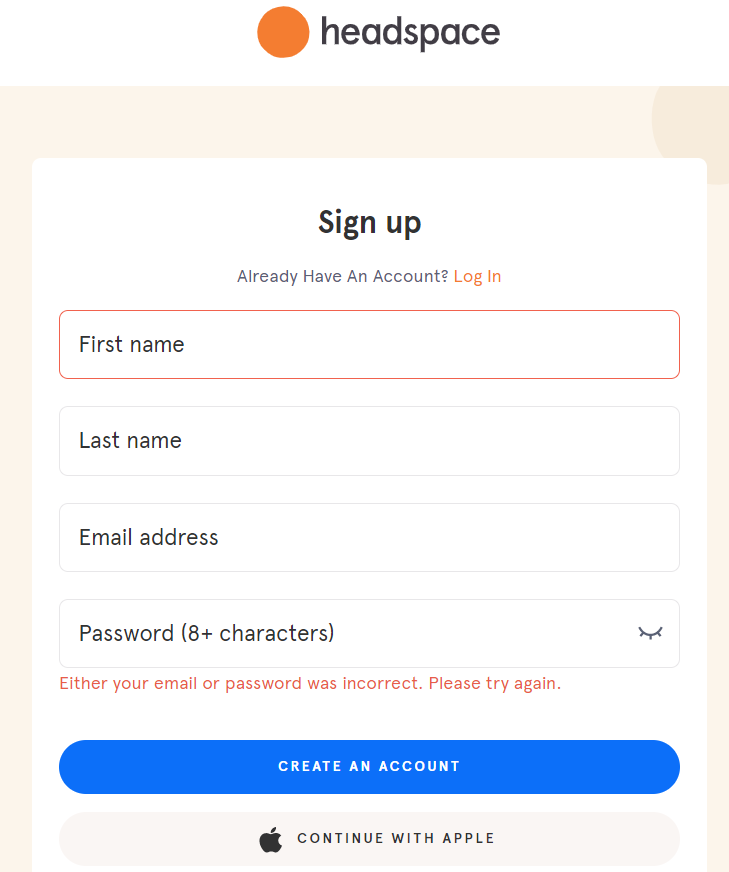
This ensures that if someone abandons the site when they are supposed to enter their payment info (one of the most common places for people to abandon), Headspace has already secured their contact information and can follow up later.
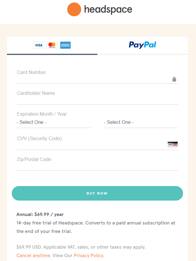
Ultimately, Headspace’s unerring focus on product has probably helped them to grow their business faster.
And if you have a product type that is compelling and allows you to offer a free trial, then you might consider doing something similar.
Next, we signed up for Headspace’s free trial and received their welcome email.
Headspace’s Welcome Email
The welcome email is often considered to be the most important email for a business.
Not just because it has a higher open and click-through rate than most emails, but because of first impressions matter.
Your welcome email is going to set the tone for the rest of your campaigns and if you don’t get that right, then you might unintentionally turn your audience off to staying on your list.
Here’s what Headspace’s welcome email looks like.
| Subject | Welcome to Headspace | |
| Preview | Get ready to learn the life-changing skill of meditation | |
| Sent | Immediately after signup | |
| CTA |  |

There are a few quick (but important) takeaways from this welcome email.
First of all, this email uses the subscriber’s name (in this case, “Email Mastery”) and welcomes the person… which is sort of the point of a welcome email, to say “Thank You” for signing up.
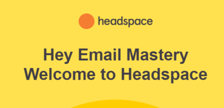
Don’t forget to welcome your subscribers and to thank them for signing up.
Also, notice how well-branded this welcome email is.
It has the Headspace logo right at the top and the playful cartoon-type graphics that Headspace is so well known for.
This helps subscribers immediately identify the brand and it shows people that you’re going to be consistent and reliable. That’s a subtle but important nuance that you should maintain within all of your emails.
Next, Headspace’s welcome email invites new members to “Start With Basics.”
If you click on that button, it will take you to the basic guided meditations that Headspace recommends starting with.
This is one of the reasons that Headspace has been so successful: they’ve created a habit-building service. Members pay every single month… and they meditate every day (or almost every day). This becomes a part of their lifestyle and so they keep paying every single month.
The “Start With Basics” email is a great way to begin that gentle habit-building process where Headspace becomes an essential part of the user’s day.
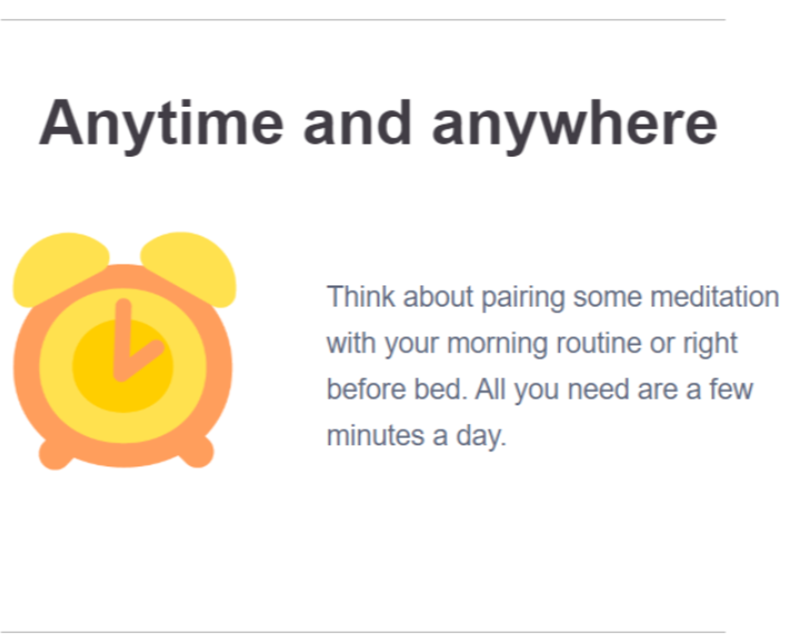
In fact, the very next part of this email encourages people to add Headspace into their morning or evening routine.
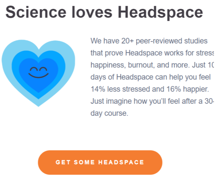
Finally, they do a quick and painless push for the scientific validity of their product.
We love this.
Because it builds confidence in Headspace’s ability to make people happier… and that’s exactly what their audience wants.
And that last part — “Just imagine how you’ll feel after a 30-day course” — is a nice touch. It encourages people (again) to build a habit and use Headspace every single day… which will typically leads to a paid subscription.
If you’re trying to create your own welcome email for your SaaS company, then you might consider doing something similar to what Headspace has done in this email. Welcome your subscribers, show them how they can use your product every single day, and then invite them to a habit-building challenge.
You might be surprised at how many people keep returning for more.
Headspace’s Abandoned Cart Email
After receiving Headspace’s welcome email, we went half-way through Headspace Plus (their main product) checkout process and then abandoned.
Shortly after, we received the following email…
| Subject | [COURSES] Quick heads-up | |
| Preview | It looks like you forgot something | |
| Sent | 1 Day after cart abandonment | |
| CTA |  |
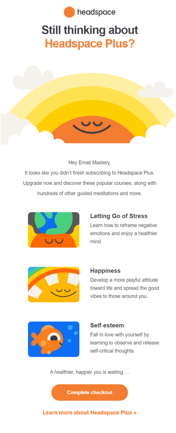
There are a lot of different ways to make your abandoned cart email more enticing. You can offer a discount or create urgency, for example.
But Headspace goes a different route — they simply remind you of the benefits of signing up.
More importantly, they dive into specific benefits of signing up.
You can “learn how to reframe negative emotions,” “develop a more playful attitude,” and “fall in love with yourself.”
Here’s why those details are so important (and powerful).
If someone tells you to purchase Headspace because it will help you meditate… you’re probably not going to buy.
But if someone tells you to purchase Headspace because it will help you reframe your negative emotions, live a happier life, and fall more in love with yourself… now you’re interested.
In other words, don’t tell people what your product can do, tell people how your product will help them (in detail, if possible).
And the abandoned cart email is a great place to do that.
Because in this email, you’re talking to people who have expressed a clear interest in your products or services. So show them what your product can do, show them how powerful your service is, show them what their life will be like if they take the leap, and sign up.
Many people abandon their cart because they are still “thinking it over.”
And what they’re “thinking” about is if your product can really solve their problem or not.
Show them that it can.
But that isn’t the only email the Headspace sent us.
Most great abandoned cart email sequences are just that… a sequence, not a single email.
Realistically, a lot of people aren’t going to see your first abandoned cart email. Maybe they didn’t check their email, maybe it went to spam, or maybe they just scrolled past it without thinking.
Emailing twice instead of once doubles your chances of reaching the prospect and closing the sale.
Here’s the second email we received one week later…
| Subject | Quick heads-up | |
| Preview | It looks like you forgot something | |
| Sent | 1 Day after the first cart abandonment email | |
| CTA |  |
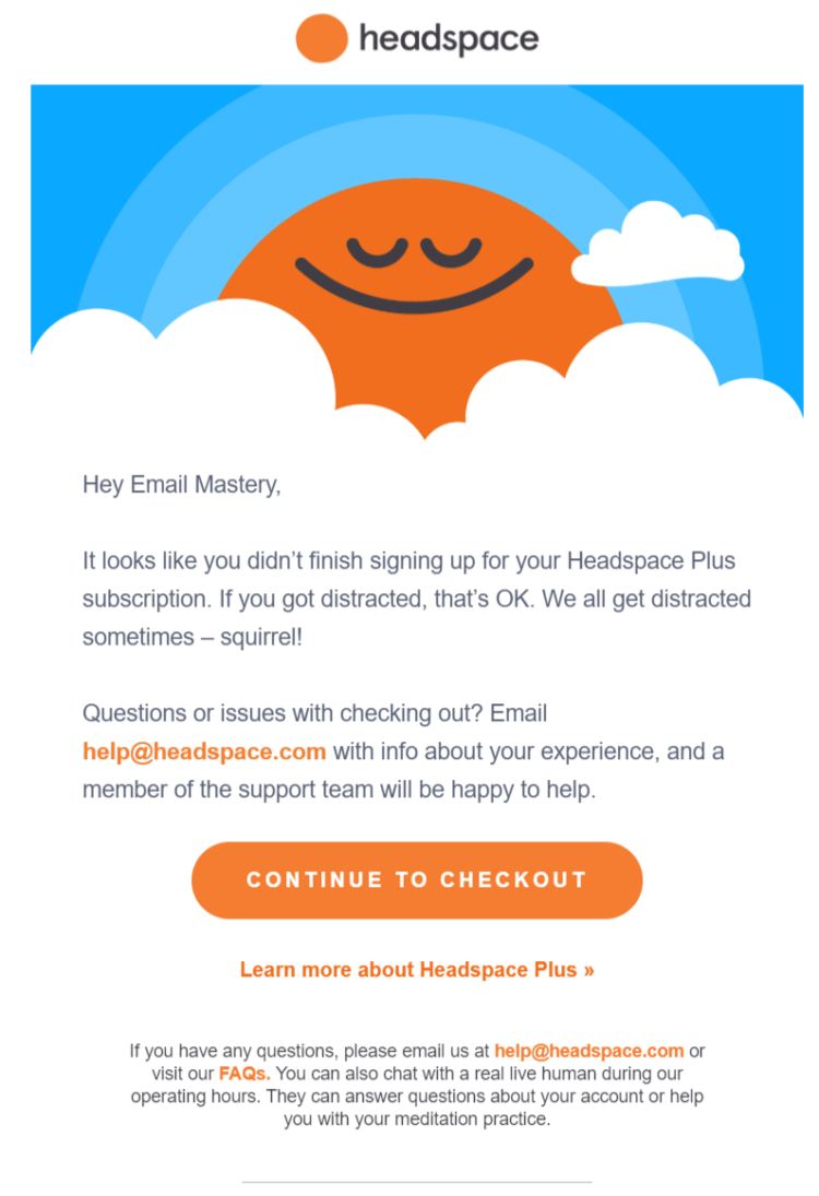
This email is simple but it does a lot of things well.
First, it gives the prospect a reason for not finishing their purchase — a socially acceptable “out” for not following through (“If you got distracted, that’s OK. We all get distracted sometimes — squirrel!”).
That’s a nice touch in an abandoned cart email.
It shows the prospect that you’re not blaming them… you’re just inviting them back.
And remember, in the first abandoned cart email, there were lots of details about the types of benefits new members will receive.
We love this email because it doesn’t have the same intensity to it. This email is dead-simple. It doesn’t even explicitly ask people to finish their purchase with the exception of the button!
That’s probably because Headspace doesn’t want to beat a dead horse.
They already made their pitch. This email is a simple reminder that if the prospect wants to sign up, they can. Otherwise, no biggie.
Sometimes, the most effective emails are also the simplest emails.
The help@headspace.com offer is also helpful for building trust and showing people that you care more about them than their money.
Headspace’s Post-Purchase Emails
What happens when you purchase from Headspace?
Well, we pulled out our wallet and bought a subscription for one month to see what Headspace’s post-purchase emails look like.
Here’s the first email we received.
| Subject | Your mindfulness journey starts here. | |
| Preview | On your mark, get, set… | |
| Sent | Immediately after purchase | |
| CTA |  |
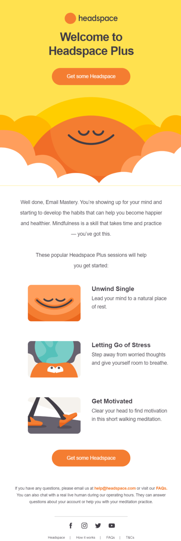
This first email, which arrives immediately after signing up, is a basic invitation to make use of your membership.
Which brings up a good point.
Don’t focus on the sale so much that you forget to cater to your actual customers. It’s far easier to sell to an existing customer than it is to a new customer. So in many ways, flattering your existing customers is more important than making a new sale.
Headspace seems to understand that if customers don’t consistently use their product… then they’re not going to stay a customer for long.
In fact, we didn’t start receiving more consistent emails from Headspace until we actually bought a membership, which suggests that they’re putting lots of energy into catering to their members.
The next email we received is a great representation of that.
| Subject | Want more out of your day? | |
| Preview | Build mindfulness into your routine | |
| Sent | A day after signup for Headspace Plus | |
| CTA |  |

By giving new members ideas for how and when to use their app, they encourage consistent, habit-building, engagement. Because again… the more that people get in the habit of using Headspace to meditate, the less likely that they’re going to cancel.
That’s the genius of this business model and email marketing strategy.
Before we paid for Headspace, we only received one email and then a few abandoned cart emails in the span of a few weeks.
But after we paid, we started receiving emails almost every other day.
The most likely reason that Headspace emails customers more than they email leads is because of a focus on customer retention.
We’ve already seen that the only way to join their email list and become a lead is by signing up for a free trial of their service. Already, that’s indicative of their product/customer-first focus.
And if you don’t become a customer after your free trial, they email you very little.
Become a customer, though, and you start receiving emails about new meditations they’ve released, tips on how to use their app, and general self-help advice.
Here’s an example…
| Subject | How you can prioritize your mental health at home | |
| Preview | Headspace is here for you | |
| Sent | The day after previous engagement email | |
| CTA |

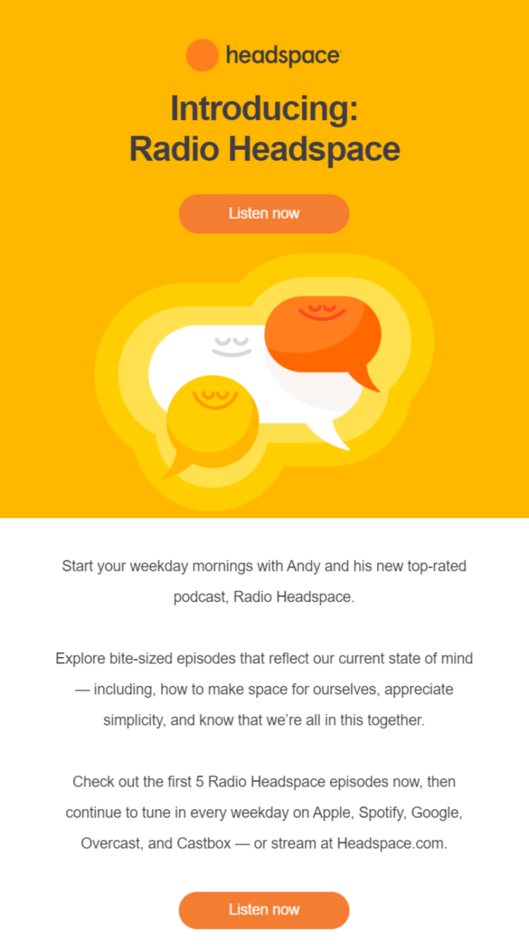
They also love to send out a new product or feature announcement emails which encourage users to keep engaging with their app. Here’s an example of that…
| Subject | New: Radio Headspace | |
| Preview | Checkout Andy’s New Podcast | |
| Sent | The day after previous engagement email | |
| CTA |  |
Headspace’s funnel seems really simple…
- Free trial
- Paid membership
- Retention
They are far more interested in retaining customers than they are in getting new customers. Fortunately for them, serving their customers well over the long-run has resulted in free word-of-mouth advertising and a plethora of new customers.
That’s not to say that Headspace doesn’t consistently run advertisements to generate leads and find new customers, but their product is always at the center of what they’re doing.
They lead with their product, and if you’re not interested in their product, then you probably won’t be getting many emails from them.
This definitely goes against the grain.
Many online businesses try to focus on customer acquisition and customer retention equally. Others focus on customer acquisition exclusively, believing that a constant stream of new customers is the best way to ensure consistent monthly revenue.
But while new customers are important for any business, focusing on serving your existing customers well (like Headspace) can have a ripple effect — it can create word-of-mouth and indirectly generate new leads and customers for your business.
Finally, after our free trial ended, we were charged and received this payment confirmation email.
| Subject | Thank you for your payment | |
| Preview | No preview text | |
| Sent | Immediately after the trial ended | |
| CTA | Visit your account for a full copy of your order, FAQs |
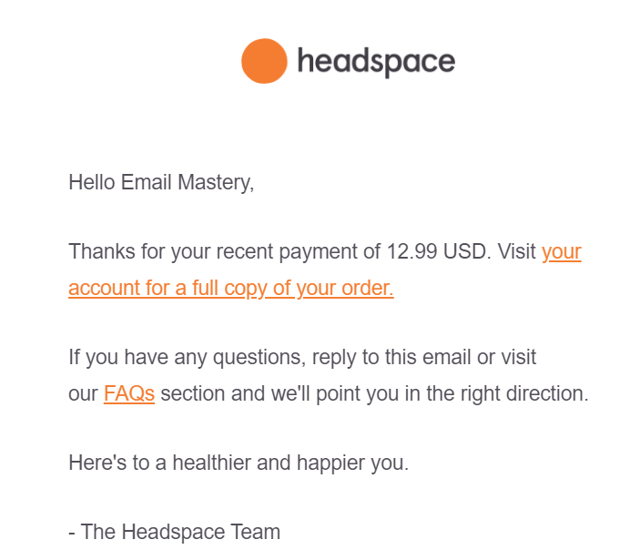
Notice the difference in design and style between their regular emails and this transactional email. The other emails we’ve looked at have lots of added designs and graphics while this transactional email is pretty simple… it has the logo at the top and then plain text.
It’s subtle, but this difference helps subscribers to tell the difference between transactional emails (which they might want to save for their records) and promotional emails.
Headspace Cancellation & Re-Enrollment Email
Churn is a big obstacle for many subscription-based businesses like Headspace.
A focus on monthly recurring revenue also requires a focus on average lifetime customer value, churn rate, and retention rate.
And as we’ve already seen, Headspace works hard — consistently releasing new features, encouraging product-related habits, and announcing new ways to use their app — to keep customers engaged.
Because the longer customers are engaged, the more Headspace can grow.
So naturally, we wanted to know what would happen if we canceled our account.
How might Headspace try to recapture us as a customer?
Here’s the cancellation confirmation email we received.
| Subject | Your cancellation confirmation | |
| Preview | No preview text | |
| Sent | Immediately after cancellation | |
| CTA | No CTA |
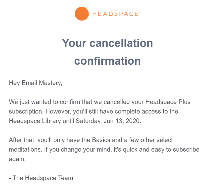
What we like most about this email is that it’s quick, to the point, and touches on all of the important elements of a cancellation email.
First of all, canceling was easy (always be wary of making canceling a subscription more difficult than it needs to be — that can hurt your reputation). Second, this email reminds us of how much longer we have access to our paid plan and what will happen after that date. And finally, it finishes with a reminder that “it’s quick and easy to subscriber again” if we should be so inclined.
What’s really interesting, though, is that after we received this cancellation email, we continued to receive their other promotional emails at the same pace as when we were a customer.
Before we were a customer, we received very few emails. After becoming a customer, we started receiving multiple emails per week… and that pace continued after canceling our account.
It seems, then, that Headspace focusses the bulk of their email marketing efforts on current customers and past customers, in hopes that the latter will re-enroll.
Speaking of which, we received this email one month after canceling our subscription.
| Subject | Let’s talk numbers | |
| Preview | A month of Headspace Plus is just $5.99 USD | |
| Sent | A month after the cancellation | |
| CTA |  |
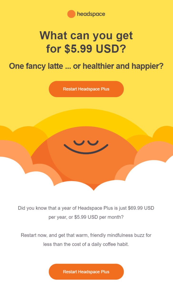
While the price comparison to a cup of coffee is compelling, the best part of this email is its timing… that it arrives one month after the customer cancels. That is important for two reasons…
- It means that the email won’t feel invasive and annoying since it hasn’t been delivered right after cancellation.
- It creates a sense that Headspace is in this for the long-game. They’re not going anywhere. And when the customer is ready to practice meditating again, they’re going to be right there waiting.
It might take a few months or even a year before a customer re-enrolls, but Headspace understands that that back-and-forth pattern is a natural part of their customer’s journey… and they craft emails that embrace it.
Download the visualized teardown
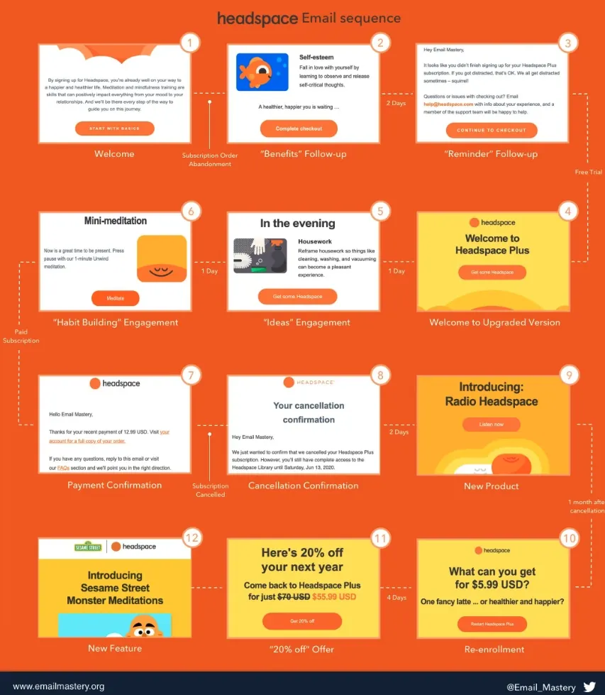
Download the Visualised Teardown
Enter your email address to download our one-page visualisation.
We respect your privacy. Unsubscribe at any time.
Conclusion
So what are the big takeaways from this email marketing teardown?
Well, a few things…
- Focusing your email efforts on customer retention is a great way to build a thriving business.
- Being product-focused with your lead generation is a great way to qualify leads.
- Encouraging your customers to build a habit around your product is a great way to keep them on board.
What takeaways did you get from this teardown?
discuss on twitter