YETI is an eCommerce store that sells all different types of outdoor gear — from trailhead dog beds and custom dog bowls to drinkware and coolers.
But this all started when YETI Coolers launched in 2006 with just one self-proclaimed mission: to “build the cooler you’d use every day if it existed.” YETI further explains…
“One that was built for the serious outdoor enthusiast rather than for the mass-discount retailers. One that could take the abuse we knew we’d put it throughout in the field and on the water. One that simply wouldn’t break. We decided early on that product innovation would come from necessity and firsthand experience – not from market research and data analysis. Today, YETI products perform when it matters most – whether that be an excursion into the remote Alaskan wilderness, chasing redfish on the Gulf coast, or just getting together with friends in the backyard.”
YETI certainly has a clear idea for what they want to accomplish as a company.
And they’ve made a big splash in the outdoor sports worlds — YETI products are sold in more than 4,800 retail stores, and they have 647 employees with annual sales of around $800 million.
Sure enough, many factors have contributed to their success, including their incessant desire to create remarkable products and their uncanny ability for speaking directly to their target market’s desires.
But as with all of our Teardowns, we’re interested in learning how YETI uses email marketing to generate leads and make sales.
So we opted-in to their email list a few months ago and here’s everything we discovered.
YETI’s Lead Generation
How does YETI generate leads and grow their email list?
That’s the first thing we wanted to determine.
We found that YETI has a few different methods for collecting email addresses. The first technique is pretty basic and can be found on most eCommerce sites.
At the bottom of each page, in the footer, they have a “Be the first to know about new products” sign-up CTA.
It’s worth pointing out that, from everywhere that we opted in on YETI’s site, nothing required us to double opt-in. That might be the case for website visitors outside of the U.S., but it was our experience.
And in a world where most marketers preach the importance of having subscribers double opt-in, this is a bit against the grain.
So why do they do it?
Well, there are pros and cons to using double opt-in. The main pro is that you won’t have any misspelled emails on your list (which result in bounces and hurt email deliverability).
Additionally, some people would argue that double opt-ins result in higher quality leads (because subscribers have to “confirm” before they’re added to an email list).
However, double opt-in also results in a lower immediate conversion rate because some people forget to confirm their email address. This could mean missing out on perfectly good leads.
YETI probably uses single opt-in to make the experience as simple and painless as possible for their subscribers (although this also means it’s twice as important for YETI to consistently clean their list of email addresses that are bouncing — we recommend either FreshAddress or EmailOversight).
And there’s certainly something to be said for making the opt-in experience seamless while placing the responsibility for list cleanliness on your own two shoulders.
Still, over time, research by GetResponse suggests that long-term conversion rate is better with double opt-in than single opt-in.
Another way that YETI grows their email list is with a timed popup that presents itself after 10 seconds, according to my stopwatch.
But this popup is a bit unique. Here’s what it looks like…
This is the first of our Teardowns with a pop-up CTA like that.
Rather than offering a discount or a free downloadable resource, they just ask if you’d like to verify free shipping your destination.
To be honest, that made us do a double-take.
Can a CTA like that really get people clicking and converting?
And the answer is probably. After all, consumers care about getting free shipping on their orders… a lot.
One report by the National Retail Federation, for example, found that a whopping 75% of people expect shipping to be free, even on orders under $50.
Similarly, 39% of consumers expect to receive free two-day shipping, and 29% have backed out of purchases because two-day shipping wasn’t free.
So maybe this popup isn’t such a bad idea.
When you click “Yes”, this is what shows up next…
What’s compelling about this popup is that it tells people that YETI does offer free shipping — and since it’s only U.S.-based exceptions are Hawaii and Alaska, the chances are good that the visitor will learn of free shipping to their area… which might then compel them to make a purchase.
In this way, YETI does a great job of turning something they already offer into an opt-in CTA.
The final way we found that YETI generates leads is through out-of-stock products. This is nothing new, but it’s an effective way to create a waitlist for popular products that need to be resupplied.
YETI’s Welcome Emails
After we opted-in to YETI’s email list, here is the first email we received, with the subject line, “Welcome to YETI Nation“…
| Subject | Welcome to YETI Nation | |
| Preheader | Let the perks begin. | |
| Sent | Immediately after signup | |
| CTA |    |

Our favorite thing about this welcome email is how YETI makes the new subscriber really feel like they’ve joined something cool… and like they’re a part of a special outdoor tribe.
They give you a warm welcome…
“We’re excited you’re officially part of our community that celebrates a quality time in the wild and can’t wait to give you the heads up about our newest gear, podcast episodes, and film launches.”
Then they invite you to listen to their podcasts and watch their films…
And next, they invite you to become a part of their even more exclusive club, as a YETI Nation Insider…
And finally, YETI invites you to follow them on Instagram and Facebook…
This is exactly what a welcome email should look like.
It hits all of the right notes without being too pushy or sales-y. It simply welcomes the new subscribers and introduces them to all of the different YETI content and platforms.
The next email that YETI sends as a part of their welcome sequence is an introduction to how YETI started and the core values by which they function.
It has the subject line, “Uncover The Story Behind YETI“, and here’s what it looks like…
| Subject | Uncover The Story Behind YETI | |
| Preheader | It all started with two brothers | |
| Sent | 4 days after signup | |
| CTA |    |

This email arrived four days after the first welcome email, which is probably for good reason.
This gives new subscribers time to browse through YETI’s podcast, films, and products, without being distracted. Then they send this email, which does a great job of strengthening the subscribers’ relationship with their brand.
At the top of the email, you can click to read the full story…
Below that, they give you a quick timeline overview of all the products that they’ve created over the last decade with parallel CTAs.
Again with this email, YETI does a wonderful job of promoting their products and brand, while at the same time strengthening their relationship with their subscribers.
YETI’s Email Newsletter
We’ve done Teardowns on companies like Nike, Huckberry, Grammarly, and Warby Parker.
Relative to most of those companies, YETI emails quite a lot.
It’s not unusual to find that eCommerce companies email once or twice per week, but YETI sends 3-4 emails per week.
And while that cadence certainly holds the possibility of overwhelming subscriber’s inboxes, YETI solves that problem with a single link at the bottom of each email titled, “My Preferences”.
If a subscriber clicks on that link, they’ll be able to quickly and easily tell YETI how often they want to receive emails and even what kind of content they want to receive (during our research, we were subscribed to all of their segments).
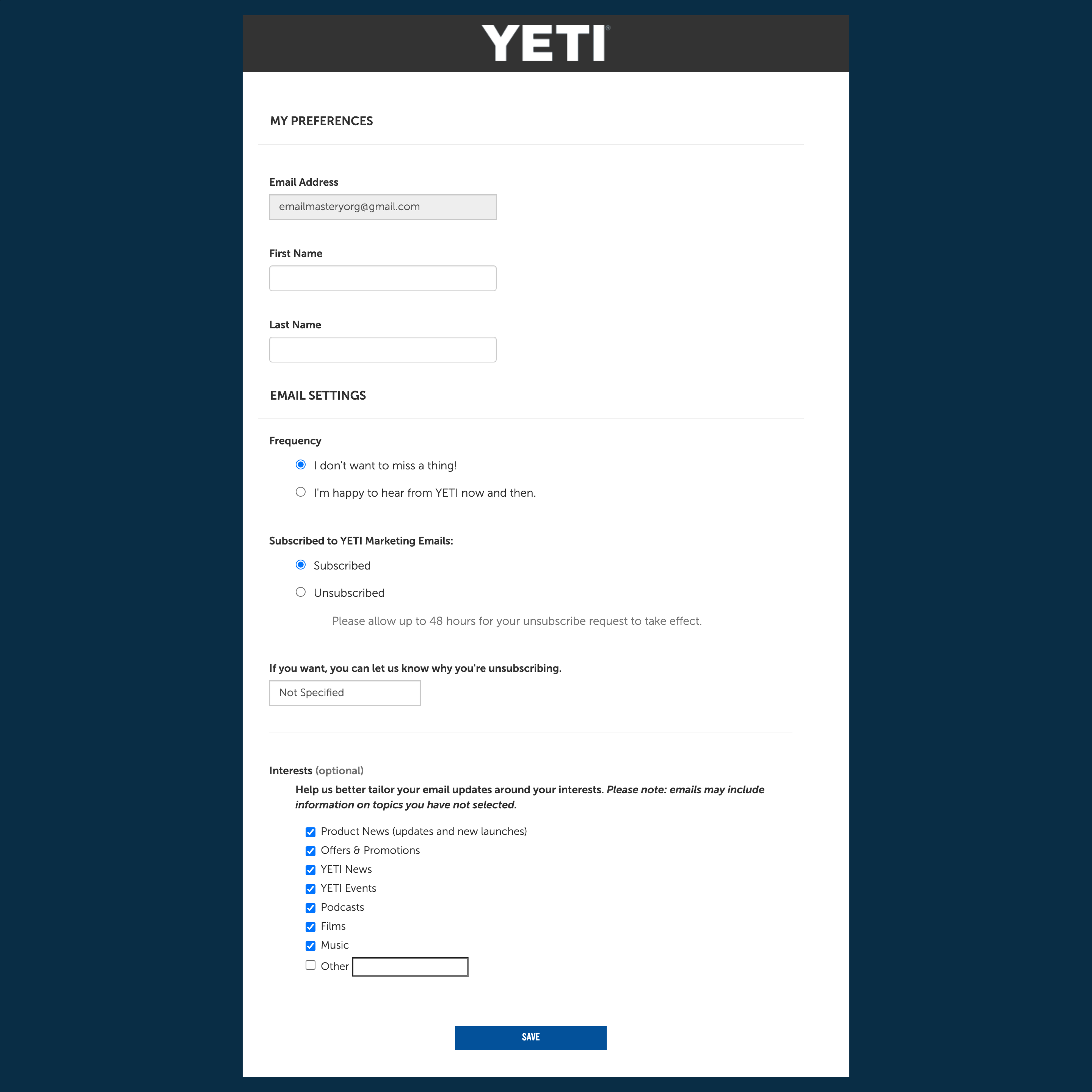
This is a phenomenal way to make sure that you’re sending each subscriber the content they want to receive when they want to receive it.
(Of course, doing this requires a savvy segmentation strategy — you can learn more about that over here)
So, what types of emails does YETI send every week?
They send product launch emails (subject line: “Well, it’s 12 O’Clock Somewhere“)…
| Subject | Well, it’s 12 O’Clock Somewhere | |
| Preheader | Introducing the new Daytrip Lunch Box | |
| Sent | 2 days after signup | |
| CTA |  |

They teach you about new ways to use their products (subject line: “Show Your MLB™ Team Pride“)…
| Subject | Show Your MLB™ Team Pride | |
| Preheader | Custom Coolers and Drinkware with your favorite MLB™ teams. | |
| Sent | Weekly Newsletter | |
| CTA |    |

And they reveal their top-rated products (“Top-Rated Gear From YETI Fans“)…
| Subject | Top-Rated Gear From YETI Fans | |
| Preheader | From tried-and-true classics to brand-new toys. | |
| Sent | 6 days after signup | |
| CTA |  |

Those are just a few examples, of course.
They also send “What a Week” emails every week that provide updates on what YETI accomplished that week, announces new items, or recommends specific products.
Here’s an example with the subject line, “What a Week: We Introduced a Brand-New Color“…
| Subject | What a Week: We Introduced a Brand-New Color | |
| Preheader | Plus, place a bid on your favorite artist-designed cooler. | |
| Sent | Weekly Newsletter | |
| CTA |    |

Here’s one more example with the subject line, “What a Week: Special Offer Up for Grabs“…
| Subject | What a Week: Special Offer Up for Grabs | |
| Preheader | Plus, pop some popcorn and discover the world of Hawaiian cowboy culture. | |
| Sent | Weekly Newsletter | |
| CTA |   |

Among all of the different types of emails that YETI sends in a given week, these “What a Week” campaigns create a semblance of consistency and predictability.
Almost every week, these emails arrive at the same time they did the past week.
One of the best parts about these emails, though, is that they make a great campaign to send to every segment of subscribers, regardless of their preference selections.
It’s a way that you can make sure that your entire list — with their different interests, demographics, and tags — are staying updated on the most important announcements.
But there’s one more thing we’d like to point out about all of YETI’s email campaigns: the FROM email address fluctuates between noreply@usmkt.yeti.com and a couple of other email addresses (customerservice@yeti.com, info@e.yeti.com) depending on the content and purpose of the email.
Pretty much all of YETI’s weekly emails are sent with the no-reply email address.
(The only ones that aren’t are transactional emails, customer service emails, and order updates)
This means that YETI’s subscribers can’t respond to any of those weekly emails, no matter how bad they want to.
They can’t say “yay” or “nay”, they can’t tell YETI how much they appreciate them, and they can’t offer constructive feedback.
To be honest, we’re not sure why the marketers at YETI have chosen to send the majority of their emails with a no-reply address, but in our opinion, it’s a sure-fire way to hinder your relationship with your audience.
Your subscribers want to engage with you.
Many of them want to have a conversation, not just listen to a monologue.
For that reason, we recommend using a no-reply email address only when it’s absolutely necessary. Here’s a great article from Active Campaign about why you shouldn’t use no-reply emails.
Still, for the most part, YETI uses its ongoing email campaigns to promote products, provide free value, and build a relationship with their audience.
And while emailing 3-4 times per week seems like a lot, it’s not if you allow people to customize their preferences.
YETI’s Abandoned Cart Email
Next, we wanted to know how YETI handles people abandoning their shopping cart.
Since, on average, 70% of people abandon their online shopping cart before finishing their purchase, this email is an important part of eCommerce success.
The abandoned cart email is simply an email that triggers when someone… well, abandons their cart.
In YETI’s case, the first cart abandonment email sends immediately and has the subject line, “Don’t Miss Out On Items In Your Cart“. Here’s what it looks like…
| Subject | Don’t Miss Out On Items In Your Cart | |
| Preheader | Your favorites are in high demand. | |
| Sent | Immediately after leaving items in the cart | |
| CTA |   |

This email is simple and quickly reminds people about the products that they’ve added to their shopping cart.
But YETI doesn’t stop there.
The day after we abandoned our cart, we received this email, with the subject line, “Items in your cart are selling fast“.
| Subject | Items in your cart are selling out fast | |
| Preheader | Don’t miss out | |
| Sent | 1 day after cart abandonment | |
| CTA |   |

The first email was a simple reminder about the products that were left in the person’s cart, but this email tries to create a little bit of urgency by saying, “Items in your cart are in high demand. Don’t let these items fly by.”
The final email we received was similar to the second email. It came 3 days after we abandoned our cart, with the subject line, “Your favorites are in high demand“.
| Subject | Your favorites are in high demand | |
| Preheader | Don’t wait too long | |
| Sent | 3 days after cart abandonment | |
| CTA |   |

Again, this email is simple and works to create a sense of urgency.
But to be honest, nothing super unique is going on with these cart abandonment emails.
The first is sent immediately, the second comes a day later, and the final one comes 3 days after abandonment.
Each is relatively simple and even the way that YETI works to create a sense of urgency isn’t that mind-blowing or profound.
But perhaps the lesson here is that setting up abandoned cart emails is the most important part — they might be simple and basic… but it’s the reminder that makes the biggest difference.
YETI’s Browse Abandonment Email
YETI doesn’t just send you an email when you abandon your shopping cart, but also when you browse their products and then leave without buying.
This was just a single email and it triggered immediately after our browse abandonment. It had the subject line, “You Viewed Our Most Popular Products“…
| Subject | You viewed out most popular products | |
| Preheader | These items are selling fast | |
| Sent | 1 day after browsing items | |
| CTA |   |

This email is simple and probably effective.
It shows the recent abandonment of the products that they viewed and then provides them with links to shop relevant categories — in this case, drinkware and soft coolers.
Maybe browsing abandonment seems like a silly time to send an email.
Cart abandonment makes sense because the person actually added the item to their shopping cart… but browsing?
Is that really effective?
Well, unsurprisingly 97% of first-time visitors leave an eCommerce site without buying… the vast majority of them never add anything to their cart either.
But here’s what’s awesome. Klaviyo (one of our favorite ESPs on the market today!) did a study of 1,000 browse abandonment campaigns sent to over one million people and these were the results…
- Average Open Rate — 52.79%
- Average Click-Through Rate — 10.87%
- Average Revenue Per Recipient — $1.35
Those numbers aren’t mind-blowing, but they are significant… especially if you consider how quickly “Revenue Per Recipient” adds up. If you’re average and you send 10,000 browse abandonment emails, you just made an additional $13,500. If you send 1,000, you made $1,350.
And considering how easy it is to set up an automated browse-abandonment campaign, this is definitely worth your time.
YETI’s Post-Purchase Emails
Finally, we purchased a product from YETI in hopes of triggering as many of their post-purchase emails as possible.
Immediately after buying, we received this confirmation email…
| Subject | YETI Coolers: New Order #XXXXXXXX | |
| Preheader | Order Received | |
| Sent | Immediately after buying | |
| CTA |

There’s nothing particularly special about this email, but it does the basics well. First of all, it looks and feels like a transaction email, and the subject line is, “YETI Coolers: New Order #XXXXXXXXX.”
So recipients know exactly what they’re getting. The title at the top increases that clarity with some personality by saying, “We received your order. Time to plan your next adventure.”
But our favorite part of this email is that YETI puts their customer service phone number right at the bottom of the email so that new customers can easily reach out if they need help.
Remember: it’s more lucrative to keep existing customers than it is to find new customers.
So it’s probably a good idea to show new customers how they can reach you if they need help (nothing is quite as frustrating as purchasing from a new company, having problems with your order, and not knowing how to get a hold of support).
YETI’s support offer might not seem very significant, but compare it to the support-offer in their other emails…
Obviously, this post-purchase footer is much more helpful — it includes their customer service phone number, a link for getting online help, cancelling your order, and even making a return.
That’s smart. Because, the better service you provide, the longer customers will stick around and the more they’ll buy from you in the future.
The day after we purchased our fancy new mug, we received this recommended-products email, with the subject line, “Since you have such great taste…”
| Subject | Since you have such great taste… | |
| Preheader | Here’s a few more products we think you’d love | |
| Sent | 1 day after purchase | |
| CTA |

This recommended products email is simple, to the point, and, most importantly, relevant to the product that we just purchased.
We highly recommend creating triggered post-purchase emails like this. Research by CoreMetrics reports the following statistics on automated product recommendation campaigns.
Whatever the exact statistics are will depend on an endless number of factors unique to your business… but one thing’s for certain: relevant product recommendations encourage new customers to keep purchasing from your business, strengthening the relationship between your company and its customers.
The same day as we received the product recommendation email, we also received an order update with the subject line, “YETI Coolers: Shipment for Order #XXXXXXXXX”
| Subject | YETI Coolers: Shipment for Order #xxxxxxxxx | |
| Preheader | Shipping confirmation | |
| Sent | 1 day after order confirmation | |
| CTA |

Then, a couple of days later, we received an email notification that our order would arrive soon. It has the subject line, “Your YETI Order is Arriving Tomorrow.”
| Subject | Your YETI Order is Arriving Tomorrow | |
| Preheader | Thank you for your order | |
| Sent | 1 day after shipping confirmation | |
| CTA |
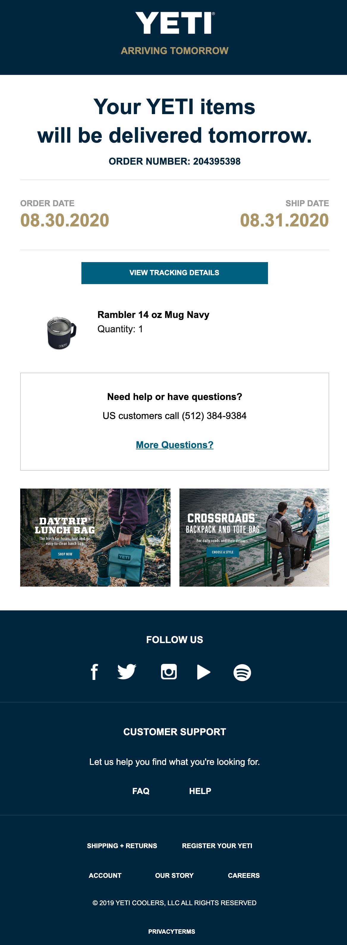
On the day of delivery, we received this automated email…
| Subject | Your YETI Package has been Delivered | |
| Preheader | Thank you for your order | |
| Sent | On the day of delivery | |
| CTA |
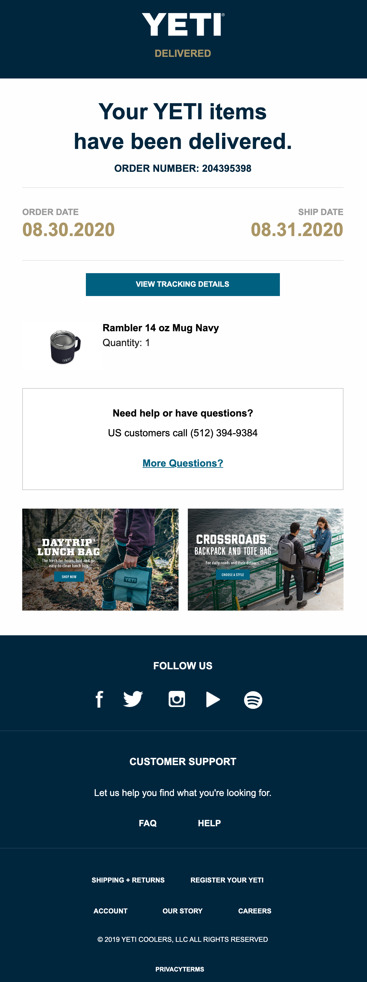
This is probably a good time to mention the importance of sending shipment and delivery updates to your customers.
Doing so builds trust and reduces the number of tickets that your customer support team has to deal with (because people aren’t calling as much to figure out when their order will be delivered).
Shipment and delivery updates are relatively easy to create with today’s technology, and most consumers expect it. You can look into services like Navar (which YETI uses) for after shipping updates.
Finally, a couple of weeks after receiving our new YETI mug, we received an email asking us for feedback. It had the subject line, “Did Your YETI Keep Its Promise?”
| Subject | Did Your YETI Keep Its Promise? | |
| Preheader | – | |
| Sent | 2 weeks after delivery | |
| CTA |  |
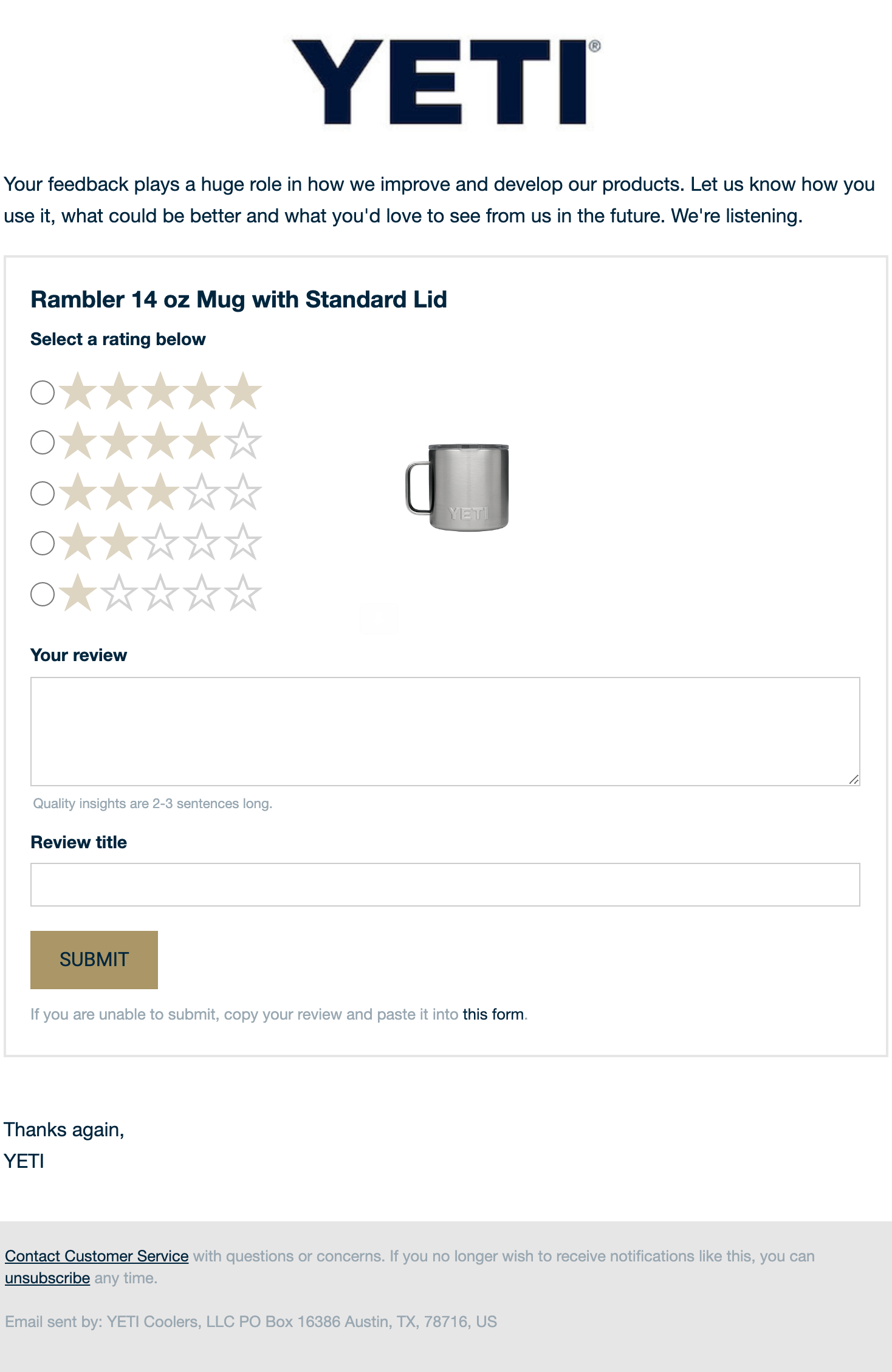
There are a few reasons that you should send feedback emails like this — particularly after your customers have had an adequate amount of time to try out your product.
First, your business needs feedback on its products or services.
There’s no such thing as a thriving, long-term business that ignores its customer’s feedback.
Feedback allows you to learn more about what your audience wants so that you can create products and services that fit their needs.
Second, asking for feedback itself is a great way to show your customers that you care about their wants, needs, and opinions — feedback emails are a great way to strengthen your relationship with your subscribers!
Download the visualized teardown
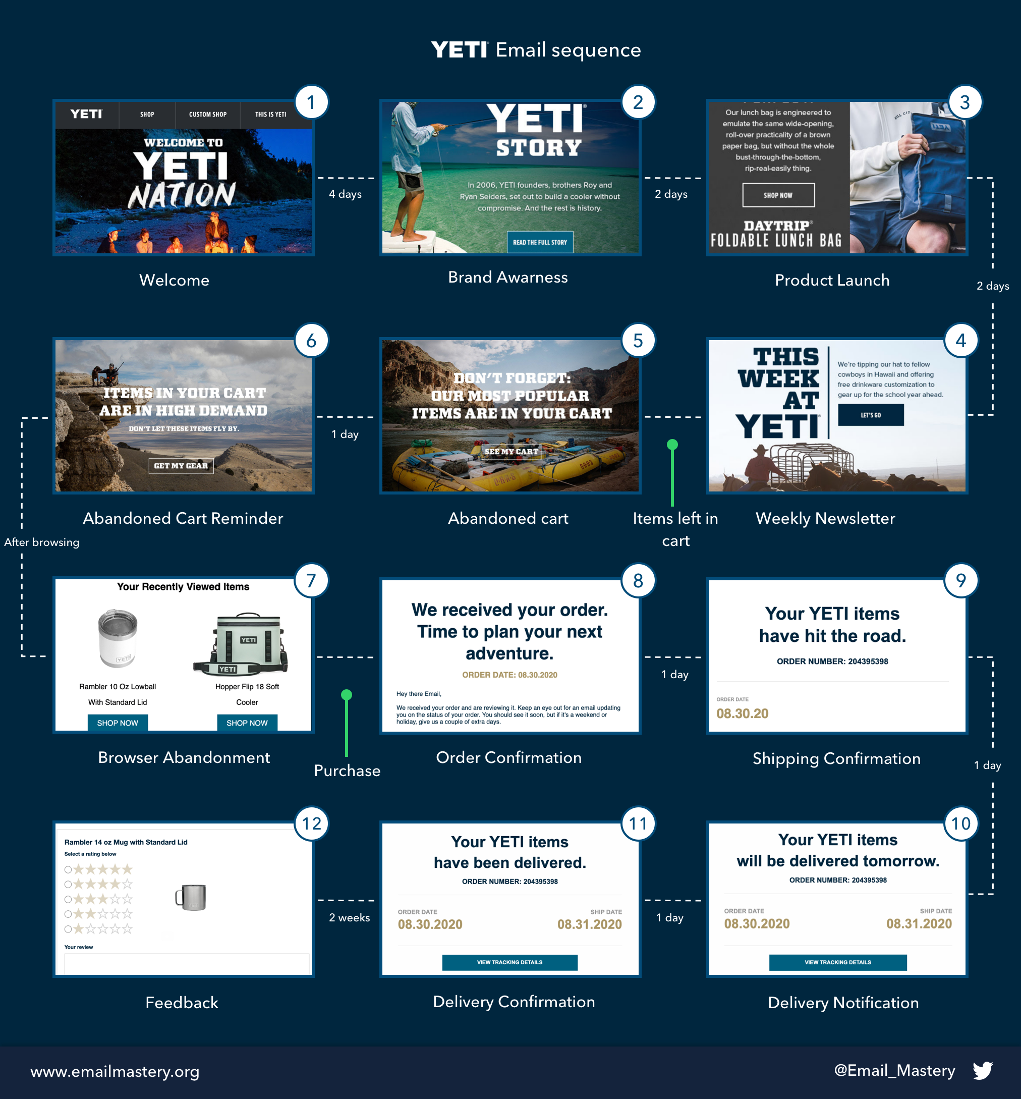
Download the Visualised Teardown
Enter your email address to download our one-page visualisation.
We respect your privacy. Unsubscribe at any time.
Conclusion
YETI has taken the outdoor gear world by storm.
By creating their own innovative products, being transparent about their core values, and building meaningful relationships with their customers, they’ve risen to become a $1.7 billion business.
And in this Teardown, you’ve discovered how they use email marketing to generate leads and make sales.
Hopefully, it’ll give you some ideas for your own business.
discuss on twitter