What are opt-in forms?
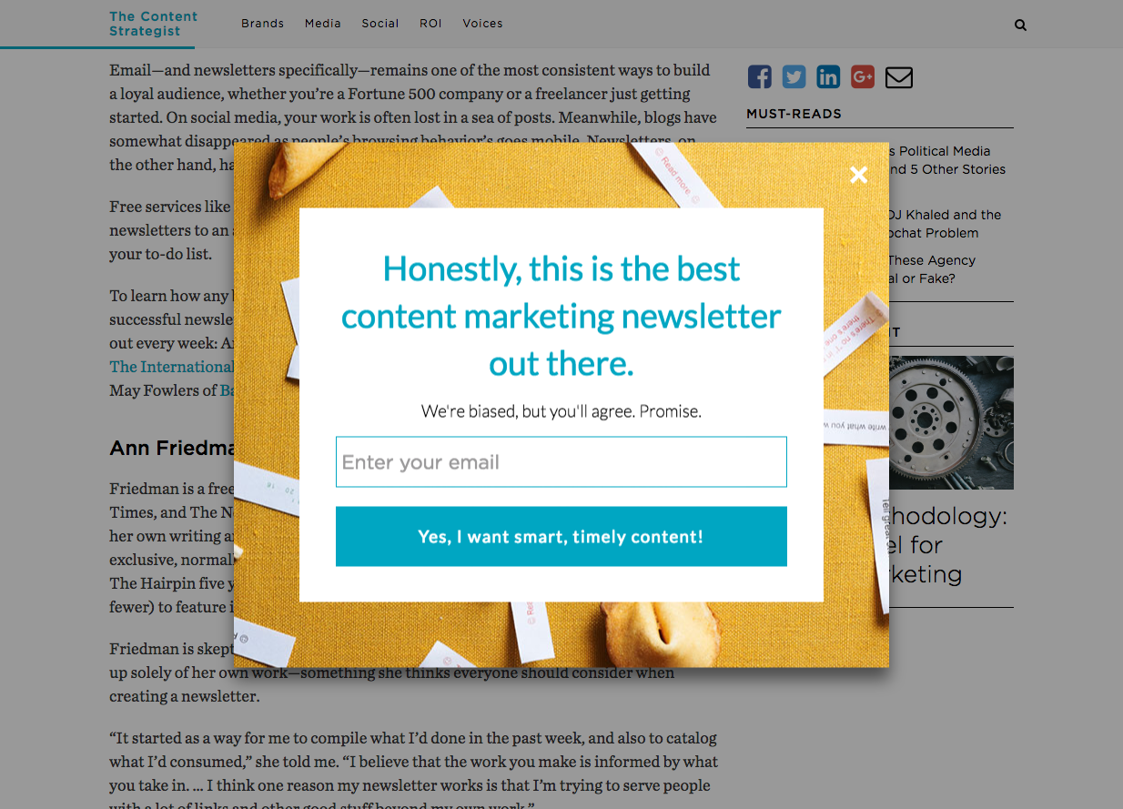
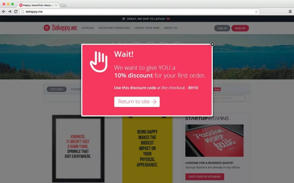
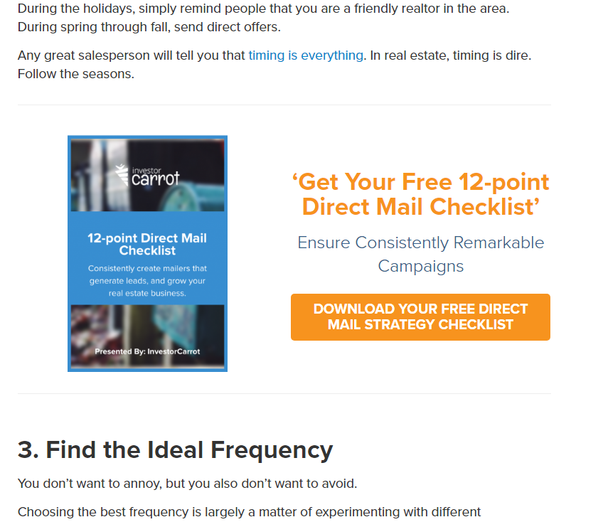
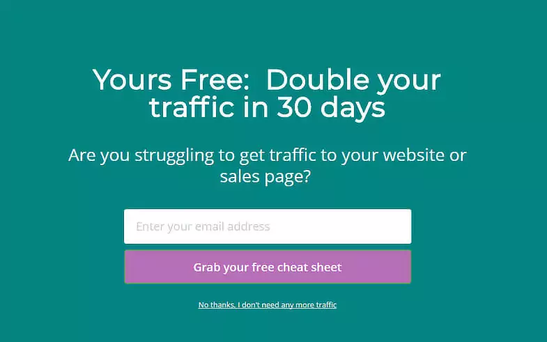
Opt-in forms refer to the place where someone actually enters their email address on your website. This could be a form as simple and basic as a single-field in-line “Subscribe To Our Newsletter” CTA or it could be as complex as a behavioral-based pop-up that offers a discount or lead magnet in return for the website visitor’s email address.
There are a lot of different types of opt-in forms.
- Pop-up — This type of form pops up on the website page after someone visits. The timing of when it pops up might be random or it might be based on some behavioral trigger, such as we’ll talk about further down this list.
- Exit Intent — This type of opt-in form pops up on the screen when the web browser indicates that the person is going to leave the website (i.e. when their mouse scrolls to the URL section of their web browser). This can be a highly effective way to catch a website visitor’s attention with a special offer or discount before they go elsewhere.
- Basic Subscribe CTA — This type of opt-in form is much more basic than a pop-up. Rather than showing up on the screen because of some type of behavioral activity, this form simply rests on the screen, usually somewhere near the header or footer of the website.

(Image Source )
- Inline — This type of form can include a lead magnet offer or it can be a simple and basic “Subscribe Now” CTA. The defining quality of an inline opt-in form is that it’s in the middle of the page somewhere, often in the middle of a blog post or landing page.
- Welcome Mat — A welcome mat is a type of opt-in form that appears a few moments after someone visits your website. Typically, a welcome mat will appear after a few seconds and take up the entire page, offering some sort of lead magnet that encourages website visitors to subscribe.
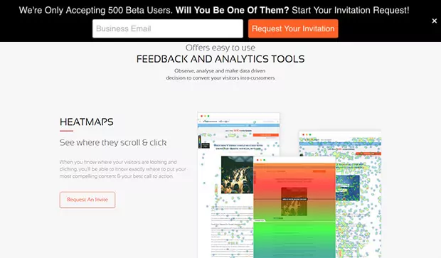
- Floating Bar — A floating bar is a subscribe form that floats at the top of the page as the visitor scrolled. It usually only leaves once the visitor either subscribes or intentionally exits out of it.
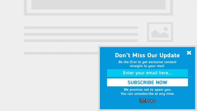
- Slide-In Form — This type of form shows up after either spending a few moments on a page or scrolling to a certain point. It comes from the bottom right or left (usually the right) and stays on the page until the website visitor either subscribes or intentionally exits out of it.
Opt-in Form and CTA Design Considerations
Different opt-in forms offers and styles work better or worse for different businesses. The most important trick to building and using an effective opt-in form is to ensure that your offer (or lead magnet) matches your ideal market’s interests. You want to get people on your email list who will be interested in your products down the road, so it’s vital to make a relevant offer that gets the right people on your list.
Here’s a helpful guide to creating an effective opt-in form for your website.
And here are a few things that you’ll want to consider.
- Look & Feel — There are a ton of different options when it comes to choosing an opt-in form for your website. And each type of form has a different feel to it. A pop-up interrupts the user-experience (not necessarily a bad thing) while a floating bar is more subtle and less invasive. It’s important to choose a style and design that fits your desired brand image.
- Language — Similar to the look and feel of your opt-in form, you should also use language that fits your desired brand image. Do you want to sound professional, smart, casual, funny? Whatever it is, make it consistent across your entire website and then include that same language on your opt-in form.
- Type of Incentive — Even though you have a lot of options when it comes to choosing the type of opt-in form you’ll use, you have even more options when choosing the incentive of that form. Really, the options are endless. You could offer a free e-book or you could have a basic subscribe-to-newsletter CTA, or you could do a million other things. Above all else, it needs to be relevant and wildly appealing to your ideal market.
- CTA — The actual words you use on your CTA button can make a difference in how many conversions you collect. Do you use the word “get” (which some marketers argue increases conversion)? Do you use the word “subscribe”? The best way to find out what works for your audience is to A/B test and find out.
For optimizing your opt-in form and CTA for conversion, check out this guide.
The final step in optimizing your opt-in form is to continue testing and iterating over time. Here’s a helpful guide from HubSpot that shows you how to do that.

